

|
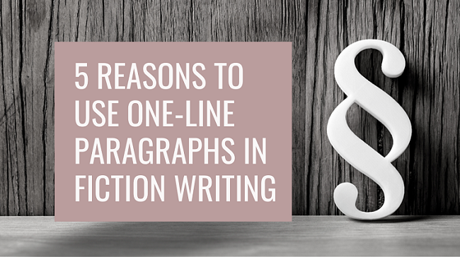
One-line paragraphs are powerful tools that pull readers into your story and compel them to turn the page. This post explores why they work and offers some examples of smashing shorties that pack a punch!
|
|
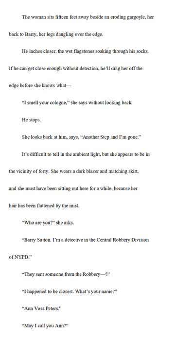
The memories arrive in a blink.
One moment nothing. The next, he knows exactly where he is, the full trajectory of his life since Helena found him, and exactly what the equations on the blackboard mean. Because he wrote them. They're extrapolations of the Schwarzschild solution, an equation that defines what the radius of an object must be, based upon its mass, in order to form a singularity. That singularity then forms an Einstein-Rosen wormhole that can, in theory, instantaneously connect far-flung regions of space and even time. |
|
One minute the memories aren’t there; the next they are. The beat of their arrival is reflected in the way the prose is formatted. We’re therefore shown how the viewpoint character experiences the lightning-speed download of knowledge, and as a result we feel it all the more intensely.
Decelerating reading speed
Those of us who read a lot are used to seeing chunks of ink on a page or pixels on a screen and learn how to zip through them and absorb the content without dissecting each word.
Such speedy reading can lead to skimming because we relax into the flow of the narrative. One-line paragraphs, however, stand out because they contrast so starkly with the longer passages, surrounded as they are by so much white space.
Text that stands out begs for our attention and forces us to slow down and focus on each word. And that means it’s not only the rhythm of the prose that’s changed; so has the rhythm of how we’re interacting with it as readers.
Take a look at this example on p. 470 of The Good Daughter by Karin Slaughter (HarperCollins, 2017).
|
There was more tapping, more tracking, and then colours on the screen were almost too much. The blacks were up so far that gray spots bubbled through the midnight fields.
Charlie suggested, “Use the blue on the lockers as a color guide. They’re close to the same blue as Dad’s funeral suit. Ben opened the color chart. He clicked on random squares. “That’s it,” Charlie said. “That’s the blue.” “I can clean it up more.” He sharpened the pixels. Smoothed out the edges. Finally, he zoomed in as close as he could without distorting the image into nothing. “Holy shit,” Charlie said. She finally got it. Not a leg, but an arm. Not one arm, but two. One black. One red. A sexual cannibal. A slash of red. A venomous bite. They had not found Rusty’s unicorn. They had found a black widow. |
|
The non-bold text is what we’re most used to seeing. It makes for a comfortable, leisurely, skimmable read. But when we get to the bold single-line paragraphs, the contrast is visible on the page. Our reading pace decelerates and our attention zooms in on every word.
Emphasizing key information
Very short paragraphs enable authors to place emphasis on key words and phrases that they want us to pay attention to. Perhaps it’s a clue or a moment of suspense. Maybe it’s to shock us. Maybe it’s to draw our focus towards an aspect of a character’s personality.
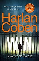
Because the one-liner stands out, it’s an opportunity for centre-staging. Here’s a great example from Harlan Coben’s Win, p. 38 (Century, 2021).
Because the one-liner stands out, it’s an opportunity for centre-staging. Here’s a great example from Harlan Coben’s Win, p. 38 (Century, 2021).
|
Respect, yes. Bow, no. I also don’t use these techniques,
per the platitude, “only for self-defense,” an obvious untruth on the level of “the check is in the mail” or “don’t worry, I’ll pull out.” I use what I learn to defeat my enemies, no matter who the aggressor happens to be (usually: me). I like violence. I like it a lot. I don’t condone it for others. I condone it for me. I don’t fight as a last resort. I fight whenever I can. I don’t try to avoid trouble. I actively seek it out. After I finish with the bag, I bench-press, powerlift, squat. When I was younger, I’d have various lifting days—arm days, chest days, leg days. When I reached my forties, I found it paid to lift less often and with more variety. |
|
Coben wants us to know something about his protagonist Windsor Horne Lockwood III, something we might find distasteful and hard to fathom. Nevertheless, it’s central to the characterization; Win’s actions throughout the novel don’t make sense unless we know this. Coben ensures we don’t miss it.
Creating clutter-free immediacy
Very short paragraphs pull the reader through each moment of the action, second by second, step by step.
This can reduce narrative distance – the space between the reader and the viewpoint character.
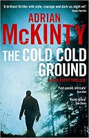
Here’s beautiful example from p. 296 of The Cold Cold Ground by Adrian McKinty (Serpent’s Tail, 2012)
This can reduce narrative distance – the space between the reader and the viewpoint character.
Here’s beautiful example from p. 296 of The Cold Cold Ground by Adrian McKinty (Serpent’s Tail, 2012)
|
“You had to stick your fucking neb in, didn’t ya? You had to open your big yapper. Can’t you fucking take a hint? After all them ciggies we give you too,” he said.
He raised the gun. I closed my eyes. Held my breath. A bang. Silence. When I opened my eyes again Bobby Cameron was staring at me and shaking his head. Billy White was dead to my left with the back of his head blown off. |
|
The narration is first person, so it’s already immersive. But the one-line paragraphs in bold drive us deeper into Sean Duffy’s experience. There’s no fluff, no filtering, no cluttering description.
Each moment of the action is presented oh so precisely, slamming us into the now of the novel – the weapon being raised, Duffy’s physical response, then what he hears: first a bang, then nothing.
In five lines and fourteen words, McKinty shows us something powerful – that he trusts us to get it. We don’t know for sure what Duffy is feeling. It could be sadness, terror, anger, resignation, or a combination of some or all those things.
The author’s had the courage to leave it to us, to allow us to imagine what this moment means internally for Duffy, rather than forcing us one way or another. In doing so, we get to be Duffy for a while rather than a fly on the wall. The narrative distance is so small, it’s barely perceptible.
Delivering suspenseful chapter finales
A smart one-liner at the end of a chapter can create suspense. Perhaps it’s a question, a shocking statement or a realization. Regardless, it leaves the reader aching for answers.
When that yearning is encapsulated in one line, it stands out and demands that we turn the page.
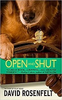
Here are the final two paragraphs from p. 132 of David Rosenfelt’s Open and Shut (Grand Central Publishing, 2002)
When that yearning is encapsulated in one line, it stands out and demands that we turn the page.
Here are the final two paragraphs from p. 132 of David Rosenfelt’s Open and Shut (Grand Central Publishing, 2002)
|
The next morning, to my undying shame, I did not withdraw my request. I had the time of my life at camp that summer, and I know now that my father, so desperate for me to go that he was in terrible pain, had millions of dollars that he refused to touch.
Money that he did not make delivering newspapers. [Chapter ends] |
|
There is only one question on the reader’s mind as the chapter closes: So how did his father make all that money?
And because the answer lies beyond – maybe in the next chapter, maybe right at the end of the book – we turn the page.
Why less is more
Overdependence on any literary device risks reducing its dramatic effect, and short paragraphs are no exception.
One-liners pack the biggest punch when they’re used now and then as a tool with which to vary the pulse of your prose and deepen your reader’s immersion in the world you’ve created.
Save them for best so that they stand out.
One-liners pack the biggest punch when they’re used now and then as a tool with which to vary the pulse of your prose and deepen your reader’s immersion in the world you’ve created.
Save them for best so that they stand out.
More writing and editing resources
|
|
Louise Harnby is a line editor, copyeditor and proofreader who specializes in working with crime, mystery, suspense and thriller writers.
She is an Advanced Professional Member of the Chartered Institute of Editing and Proofreading (CIEP), a member of ACES, a Partner Member of The Alliance of Independent Authors (ALLi), and co-hosts The Editing Podcast.
She is an Advanced Professional Member of the Chartered Institute of Editing and Proofreading (CIEP), a member of ACES, a Partner Member of The Alliance of Independent Authors (ALLi), and co-hosts The Editing Podcast.
- Get in touch: Louise Harnby | Fiction Editor & Proofreader
- Connect: Twitter at @LouiseHarnby, Facebook and LinkedIn
- Learn: Books and courses
- Discover: Resources for authors and editors
2 Comments
This post explains when and how to indent your narrative and dialogue according to publishing-industry convention.
The purpose of first-line indents
Each new paragraph signifies a change or shift of some sort ... perhaps a new idea, piece of action, thought or speaker, even a moderation or acceleration of pace. Still, the prose in all those paragraphs within a section is connected.
Paragraph indents have two purposes in fiction:
First lines in chapters and new sections
Chapters and sections are bigger shifts: perhaps the viewpoint character changes, or there's a shift in timeline or location.
To mark this bigger shift in a novel, it’s conventional not to indent the first line of text in a new chapter or a new section. You might hear editorial folks refer to this non-indented text as full out.
NARRATIVE LAYOUT
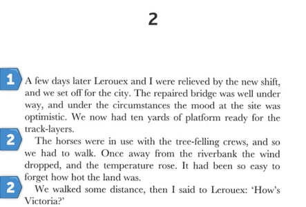
The following example is taken from Part 5, Chapter 2, of Christopher Priest’s Inverted World (p. 287, 2010):
Each new paragraph signifies a change or shift of some sort ... perhaps a new idea, piece of action, thought or speaker, even a moderation or acceleration of pace. Still, the prose in all those paragraphs within a section is connected.
Paragraph indents have two purposes in fiction:
- Readability: They help the reader identify the shifts visually.
- Connectivity: They indicate a journey. Indented paragraphs are related to what's come before ... part of the same scene.
First lines in chapters and new sections
Chapters and sections are bigger shifts: perhaps the viewpoint character changes, or there's a shift in timeline or location.
To mark this bigger shift in a novel, it’s conventional not to indent the first line of text in a new chapter or a new section. You might hear editorial folks refer to this non-indented text as full out.
- This is standard with narrative and dialogue.
- The convention applies regardless of your line spacing.
NARRATIVE LAYOUT
The following example is taken from Part 5, Chapter 2, of Christopher Priest’s Inverted World (p. 287, 2010):
- Paragraph 1 is the first in the chapter.
- The first line is not indented.
- The first lines of the paragraphs that follow it (2) are indented.
And here's an example from Part 2, Chapter 6, p. 147, which shows how the layout works the same after a section break:
- Paragraph 1 is the first in the section.
- The first line is not indented.
- The first lines of the paragraphs that follow it (2) are indented.
Even if an author chooses to include a design feature such as a dropped capital (sometimes called a drop cap), it's standard for that letter to be full out, as shown in the following example from To Kill a Devil (John A. Connell, p. 6, Nailhead Publishing, 2020):
- Paragraph 1 is the first in the chapter.
- The capital letter on the first and second lines is not indented.
- The first line of the paragraph that follows it (2) is indented.
DIALOGUE LAYOUT
The same applies even if the chapter or section starts with dialogue, as in this excerpt from David Rosenfelt's Dog Tags (p. 192, Grand Central, 2010):
The same applies even if the chapter or section starts with dialogue, as in this excerpt from David Rosenfelt's Dog Tags (p. 192, Grand Central, 2010):
- Paragraph 1 is the first in the chapter.
- The first line is not indented.
- The first lines of the paragraphs that follow it (2) are indented.
Body text: dialogue and narrative
The example below from Blake Crouch's Recursion (p. 4, Macmillan, 2019) shows how the indentation works in the body text when there's a mixture of dialogue and narrative.
The example below from Blake Crouch's Recursion (p. 4, Macmillan, 2019) shows how the indentation works in the body text when there's a mixture of dialogue and narrative.
- Regardless of whether the prose is narrative or reported speech, the text is indented.
- The convention applies regardless of line spacing.
IMPACT OF LINE SPACING
Even if you've elected to set your book file with double line spacing (perhaps at the request of a publisher, agent or editor), the indentation convention applies. Here's the Recursion example again, tweaked to show what it would look like:
Even if you've elected to set your book file with double line spacing (perhaps at the request of a publisher, agent or editor), the indentation convention applies. Here's the Recursion example again, tweaked to show what it would look like:
|
|
Indenting text that follows special elements
Your novel might include special elements such as letters, texts, reports, lists or newspaper articles. Authors can choose to set off these elements with wider line spacing, but how do we handle the text that comes after?
Again, it's conventional to indent text that follows this content, regardless of whether it's narrative or dialogue. That's because of the connective function; the text is part of the same scene.
Here are some examples from commercial fiction pulled from my bookshelves.
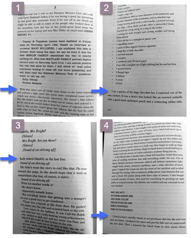
- REPORT: The Outsider, Stephen King, Hodder, 2018, p. 252
- LIST: Life of Pi, Yann Martel, Canongate, 2002, p. 146
- TRANSCRIPT: Snap, Belinda Bauer, Black Swan, 2018, p. 36
- RECORD: Ready Player One, Ernest Cline, Arrow, 2012, p. 300
It's not the case that full-out text is never used, or can't be used, but fiction readers are used to conventions. When a paragraph isn't indented, they assume it's a new section, which creates a tiny disconnect.
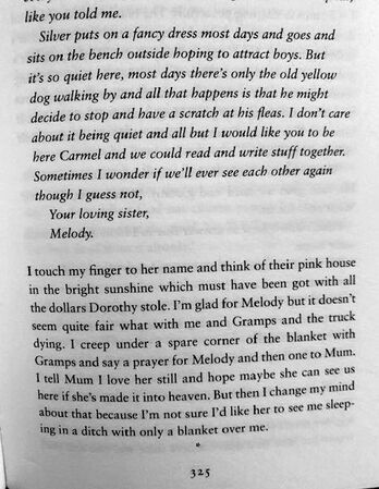
That's what I think's happened in the example below from Kate Hamer's The Girl in the Red Coat (p. 325, Faber & Faber, 2015). Of course, it took me only a split second to work out that the narrator is referring to the preceding letter, but it's a split second that took me away from the story because I'd assumed I was looking at a section break.
My preference would be to indent 'I touch my finger [...]' because that text is part of the scene, not a new section.
How to create a first-line indent in Word
Let's finish with some quick guidance on creating first-line indents.
Avoid using spaces and tabs to create indents in Word. Instead, create proper indents. There are several ways to do this.
Let's finish with some quick guidance on creating first-line indents.
Avoid using spaces and tabs to create indents in Word. Instead, create proper indents. There are several ways to do this.
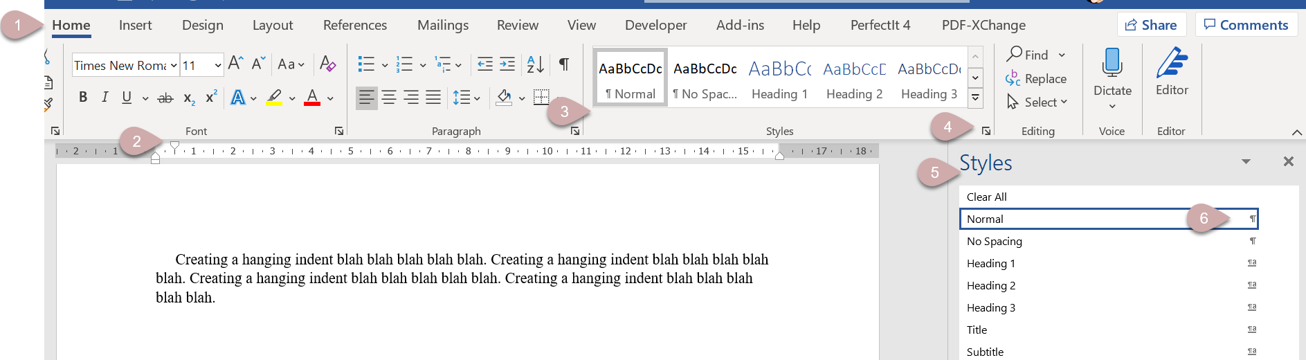
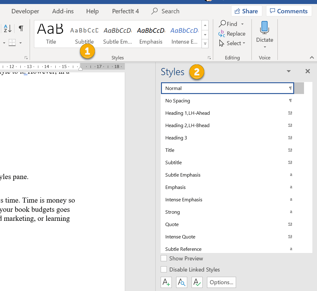
- Open the Home tab (1).
- Select your text.
- Move your cursor to the ruler and select the top marker (2).
- Drag it to the position of your preferred indent.
- Right-click on the style in the ribbon (3).
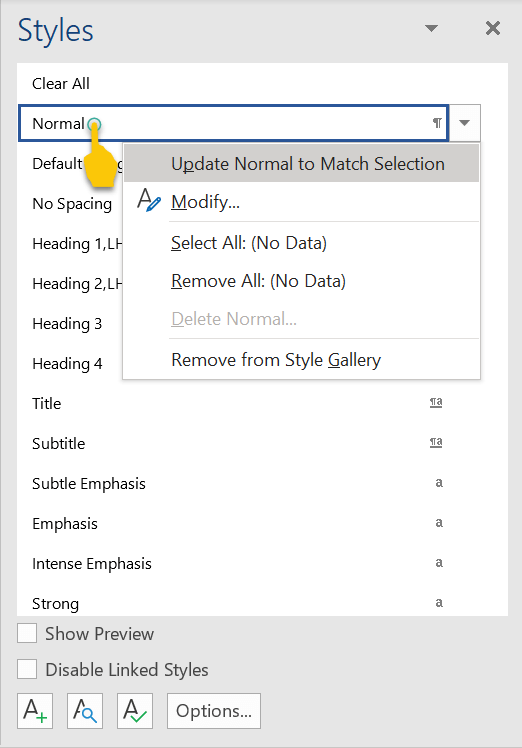
- Select 'Update Normal to Match Selection'.
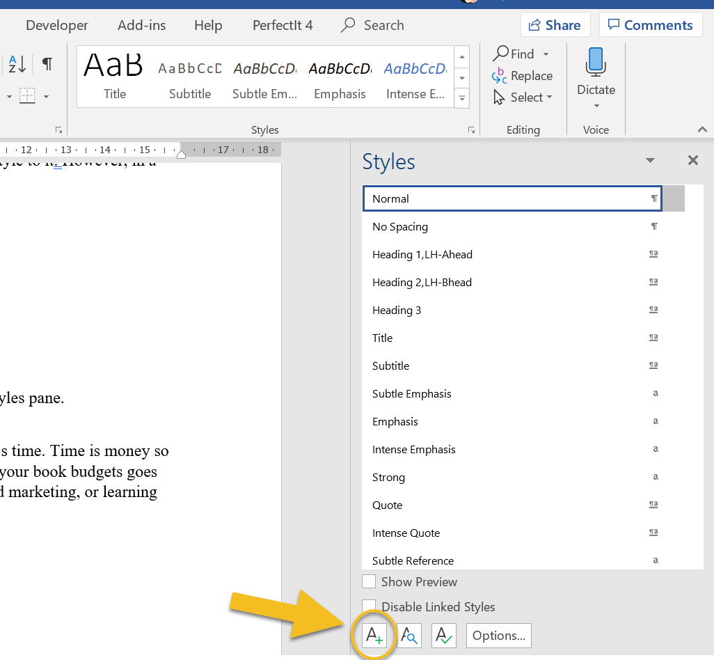
- Open the Home tab (1).
- Open the Styles pane via the arrow icon (4).
- Select your text.
- Move your cursor to the ruler and select the top marker (2).
- Drag it to the position of your preferred indent.
- Go to the Styles pane (5) and right-click on the style (6).
- Select 'Update Normal to Match Selection'.
OR
- Open the Home tab (1).
- Open the Styles pane via the arrow icon (4).
- Go to the Styles pane (5) and right-click on the style (6).
- Select 'Modify' to open the Modify Styles pane (A).
- Click on the Format button in the bottom left-hand corner (B).
- Select Paragraph to open the Paragraph pane (C).
- Make sure you're in the Indents and Spacing tab.
- Look at the Indentations section in the middle. Make sure 'First line' is selected under 'Special:' (D).
- Adjust the first-line indent according to your preference (E).
- Click OK (F).
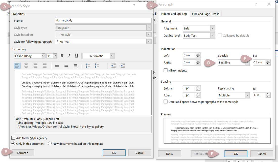
Create a new style for your full-out paragraphs using the same tools.
If you need more assistance with creating styles, watch this free webinar. There's no sign-up; just click on the button and dig in.
- If using the ruler, ensure the markers (2) are aligned, one on top of the other.
- If using the styles pane, adjust the indent spacing (E) to zero.
If you need more assistance with creating styles, watch this free webinar. There's no sign-up; just click on the button and dig in.
Louise Harnby is a line editor, copyeditor and proofreader who specializes in working with crime, mystery, suspense and thriller writers.
She is an Advanced Professional Member of the Chartered Institute of Editing and Proofreading (CIEP), a member of ACES, a Partner Member of The Alliance of Independent Authors (ALLi), and co-hosts The Editing Podcast.
Visit her business website at Louise Harnby | Fiction Editor & Proofreader, say hello on Twitter at @LouiseHarnby, connect via Facebook and LinkedIn, and check out her books and courses.
Are you spending too much time on your novel’s text design? Here’s how to use the Styles function in Microsoft Word to ensure the various elements are formatted consistently.
In this article, I’ll walk you through the following:
What is the Styles tool?
The Styles tool allows you to apply design consistency to the various text elements in your book. In a novel, you might want to create different styles for the following:
Microsoft Word has a handy suite of on-board styles, though it’s unlikely they’ll match your specific requirements. Modifying these is still a little quicker than creating fresh styles so take a look at the properties and work out what you’ll retain and what you’ll change.
What properties can you influence?
You can influence every property of your text when you assign a style to it. However, in a novel, you’ll most likely focus on the following:
How to access the Styles tool
There are two ways to access the Styles function onscreen:
- What the Styles tool is
- The properties you can influence
- How to access the Styles tool
- Why it’ll save you time to use styles
- 3 ways to create a style
- 2 ways to modify a style
- How to assign a style to an element of text
- Troubleshooting
- How heading styles help you navigate
What is the Styles tool?
The Styles tool allows you to apply design consistency to the various text elements in your book. In a novel, you might want to create different styles for the following:
- book title
- author
- chapter titles
- subheadings
- indented body text
- full-out paragraphs in new chapters or sections
- displayed matter such as letters, texts, emails, reports
Microsoft Word has a handy suite of on-board styles, though it’s unlikely they’ll match your specific requirements. Modifying these is still a little quicker than creating fresh styles so take a look at the properties and work out what you’ll retain and what you’ll change.
What properties can you influence?
You can influence every property of your text when you assign a style to it. However, in a novel, you’ll most likely focus on the following:
- paragraph indentation
- spacing above and below the text
- font
- size
- colour
- italicization and bolding
- alignment (left, right, centred and justified)
- page flow (widow/orphan control; ensuring headings and corresponding text don’t fall on separate pages; page breaks)
How to access the Styles tool
There are two ways to access the Styles function onscreen:
- the Styles gallery in the ribbon
- the Styles pane
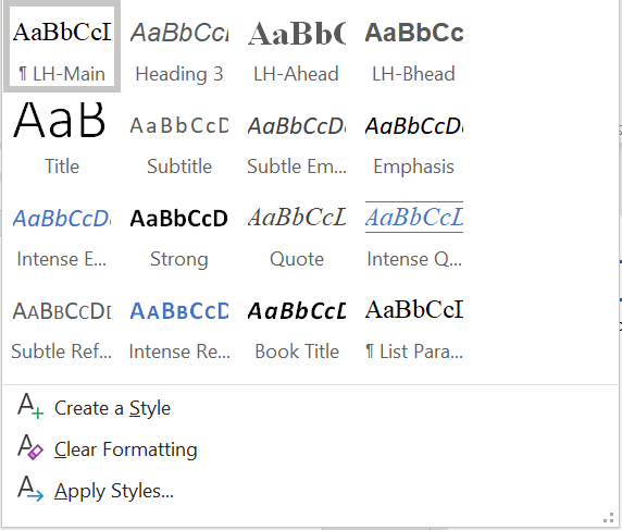
The gallery in the ribbon offers a preview of how the style appears. If I’m working with a lot of different text elements in a document, I find these visual clues useful when I want to locate a style quickly.
On smaller screens, less of the Styles gallery will be visible. To access the previews of all the styles in your gallery, click on the MORE arrow (circled).
On smaller screens, less of the Styles gallery will be visible. To access the previews of all the styles in your gallery, click on the MORE arrow (circled).
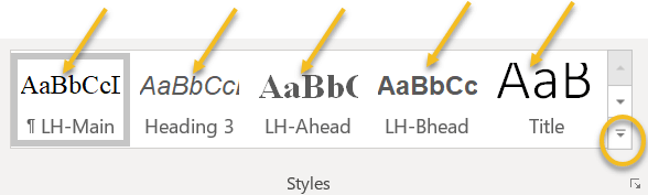
A new window will appear containing the full gallery.
Why you should format with styles
Using styles gives you control over design, consistency and formatting time.
Time is money, so when you do the job instead of asking other professionals to do it, your book budgets goes further. Perhaps you can invest a little more time or money on cover design, sales and marketing, or learning how to improve writing craft.
Can you format manually? Of course, but you could be making a lot of unnecessary work for yourself.
Scenario 1
You complete the writing, drafting, and editing, and get cracking on designing the layout. Now that there are 85,000 words in place, your thriller’s looking more like a textbook thanks to the font you’ve chosen for your main text: Arial 14. A serif font like Times New Roman would be easier on your reader’s eye.
The problem is, you can’t select all the text in the file with CTRL A and change it in one fell swoop because that would affect the chapter headings and the emails your transgressor is sending to the police, all of which are formatted differently. Instead, you have to work through the file, locate the main text elements manually, and change the font.
If, however, you’ve assigned a style to your main text, you can modify that font property in just a few clicks. The change will automatically change all the main text, and only that element, to your new font. Further down, I’ll show you how.
Scenario 2
You’ve written 12 additional paragraphs for your book but they’re in another document. You copy and paste the writing into your book file. Now you have to manually format the new sections so that they match the existing work.
If you’ve assigned styles, however, it’s as simple as cut, paste and left-click. Job done.
How to create a style
There are several ways to create a style in Word:
1A. Manual method
Open the styles pane and left-click on the A+ button in the bottom-left-hand corner.
Using styles gives you control over design, consistency and formatting time.
Time is money, so when you do the job instead of asking other professionals to do it, your book budgets goes further. Perhaps you can invest a little more time or money on cover design, sales and marketing, or learning how to improve writing craft.
Can you format manually? Of course, but you could be making a lot of unnecessary work for yourself.
Scenario 1
You complete the writing, drafting, and editing, and get cracking on designing the layout. Now that there are 85,000 words in place, your thriller’s looking more like a textbook thanks to the font you’ve chosen for your main text: Arial 14. A serif font like Times New Roman would be easier on your reader’s eye.
The problem is, you can’t select all the text in the file with CTRL A and change it in one fell swoop because that would affect the chapter headings and the emails your transgressor is sending to the police, all of which are formatted differently. Instead, you have to work through the file, locate the main text elements manually, and change the font.
If, however, you’ve assigned a style to your main text, you can modify that font property in just a few clicks. The change will automatically change all the main text, and only that element, to your new font. Further down, I’ll show you how.
Scenario 2
You’ve written 12 additional paragraphs for your book but they’re in another document. You copy and paste the writing into your book file. Now you have to manually format the new sections so that they match the existing work.
If you’ve assigned styles, however, it’s as simple as cut, paste and left-click. Job done.
How to create a style
There are several ways to create a style in Word:
- manually – 2 options
- by updating an existing unused style to match a piece of text you’ve selected or clicked within
1A. Manual method
Open the styles pane and left-click on the A+ button in the bottom-left-hand corner.
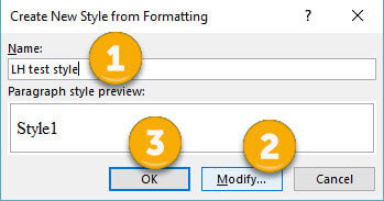
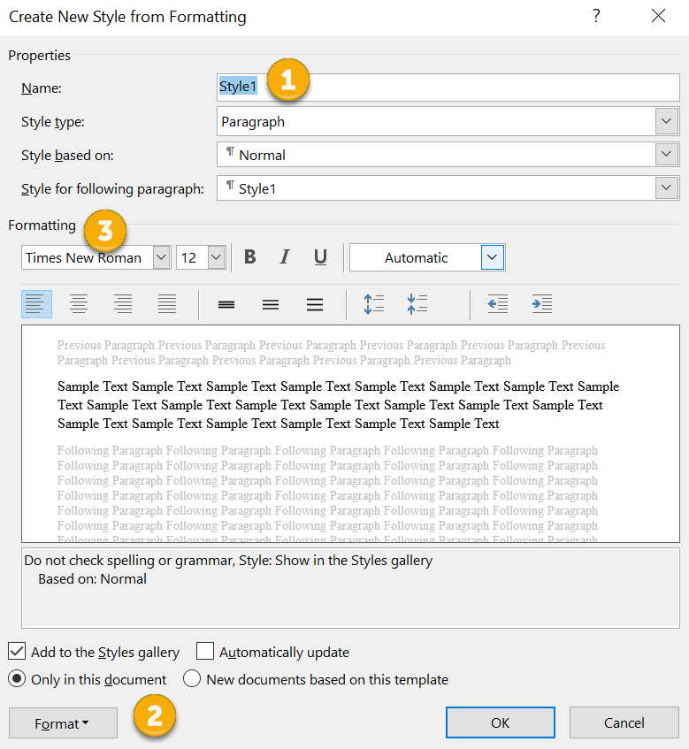
A new window will open (CREATE NEW STYLE FROM FORMATTING). Now you can give your style a name (1) and assign properties to the font, paragraph spacing and page flow (2 and 3).

1B. Manual method B
Alternatively, right-click on a piece of text that’s already formatted according to your preferences. A mini toolbar will appear. Click on the Styles button.
Alternatively, right-click on a piece of text that’s already formatted according to your preferences. A mini toolbar will appear. Click on the Styles button.
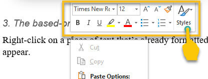
A new window will appear. Left-click on CREATE A STYLE.
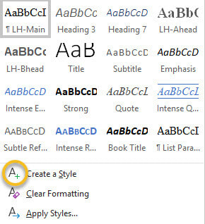
Name your style, modify if you wish, and left-click OK.
2. Updating method
Select a piece of text that’s already formatted according to your preferences. Now head up to the Styles gallery in the ribbon, or the Styles pane, and right-click on an unused style that you’re happy to update. Hover over UPDATE [STYLE] TO MATCH SELECTION, then left-click.
Select a piece of text that’s already formatted according to your preferences. Now head up to the Styles gallery in the ribbon, or the Styles pane, and right-click on an unused style that you’re happy to update. Hover over UPDATE [STYLE] TO MATCH SELECTION, then left-click.
How to modify a style
There are two ways to modify a style in Word:
1. Styles gallery
Go to the Styles gallery in the ribbon and right-click on the style you want to modify.
There are two ways to modify a style in Word:
- via the Styles gallery in the ribbon
- via the Styles pane
1. Styles gallery
Go to the Styles gallery in the ribbon and right-click on the style you want to modify.
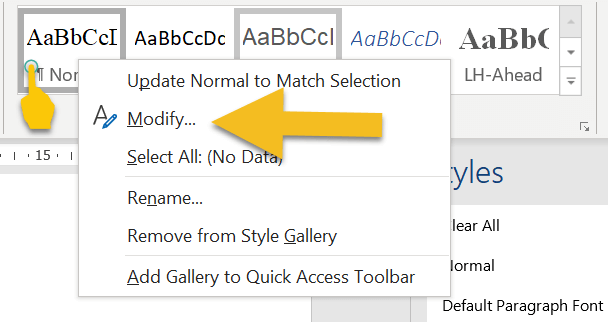
Left-click on MODIFY and amend the properties of your style. Note that this will change every piece of text assigned with that style.
2. Styles pane
Go to the Styles pane on the right-hand side of your screen and right-click on the style you want to modify.
Go to the Styles pane on the right-hand side of your screen and right-click on the style you want to modify.
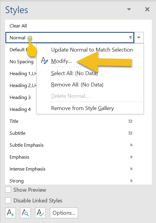
Left-click on MODIFY and amend the properties of your style. Again, bear in mind that this will change every piece of text with that style assigned.
How to assign a style to an element of text
If a piece of text isn’t formatted correctly, left-click the cursor on a word or in a paragraph, or select it by double-clicking.
Now head up to the Styles gallery in the ribbon, or the Styles pane, and left-click on the preferred style. Your style will be assigned.
If you’re working on a smaller screen, you’ll probably find it easier to use the Styles gallery in the ribbon because it takes up less space than the Styles pane.
To close the Styles pane and free up some screen real-estate, left-click on the X in the top-right-hand corner.
Troubleshooting
Here’s how to fix some of the more common problems that arise when working with styles.
1. Styles gallery or pane isn’t visible
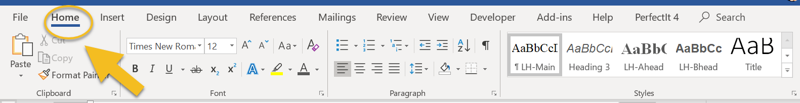
If the Styles gallery isn’t visible, make sure you’re in the HOME tab in the ribbon.
Here’s how to fix some of the more common problems that arise when working with styles.
1. Styles gallery or pane isn’t visible
If the Styles gallery isn’t visible, make sure you’re in the HOME tab in the ribbon.
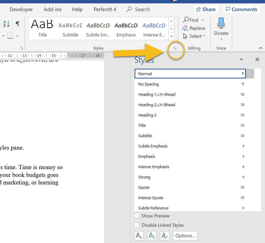
If the Styles pane isn’t visible, left-click on the small arrow in the Styles gallery.
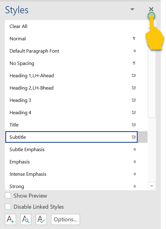
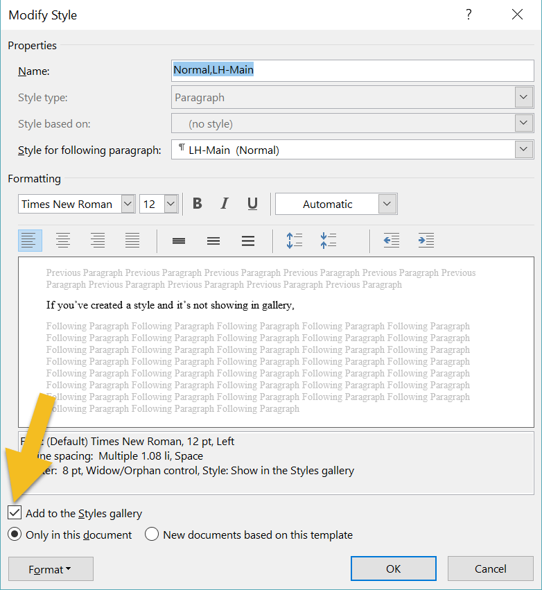
2. Style not showing in gallery
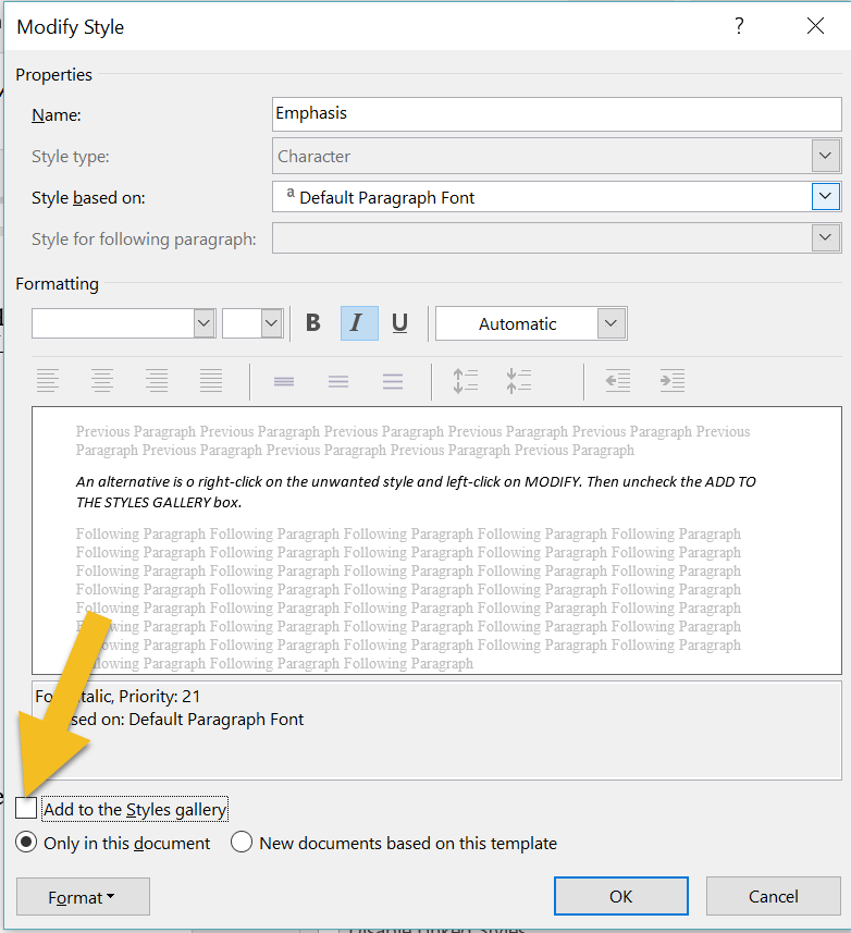
If you’ve created a style and it’s not showing in gallery, head to the Styles pane and right-click on the missing style. This opens the MODIFY pane. Make sure that the ADD TO THE STYLES GALLERY box is checked.
If you’ve created a style and it’s not showing in gallery, head to the Styles pane and right-click on the missing style. This opens the MODIFY pane. Make sure that the ADD TO THE STYLES GALLERY box is checked.
3. The gallery is cluttered with unused styles
If your gallery is busy with styles you don’t need to access, there are two ways to remove them. The quickest method is to right-click on an unwanted style, then left-click on REMOVE FROM STYLE GALLERY.
If your gallery is busy with styles you don’t need to access, there are two ways to remove them. The quickest method is to right-click on an unwanted style, then left-click on REMOVE FROM STYLE GALLERY.
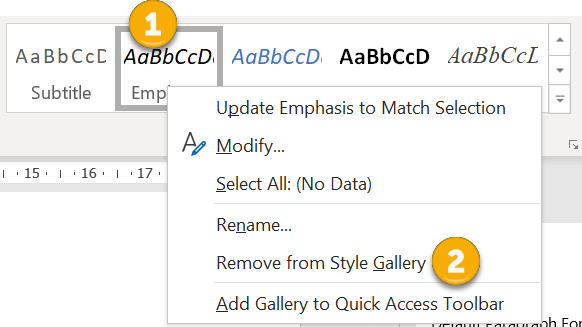
An alternative is to right-click on the unwanted style and left-click on MODIFY. Then uncheck the ADD TO THE STYLES GALLERY box.
4. You’ve renamed a style but Word’s default name is still displayed in the pane
If you’re using the Styles pane to apply styles, the list might appear cluttered if Word’s default names are displaying, even though you've modified them. To fix, left-click on the OPTIONS button.
If you’re using the Styles pane to apply styles, the list might appear cluttered if Word’s default names are displaying, even though you've modified them. To fix, left-click on the OPTIONS button.
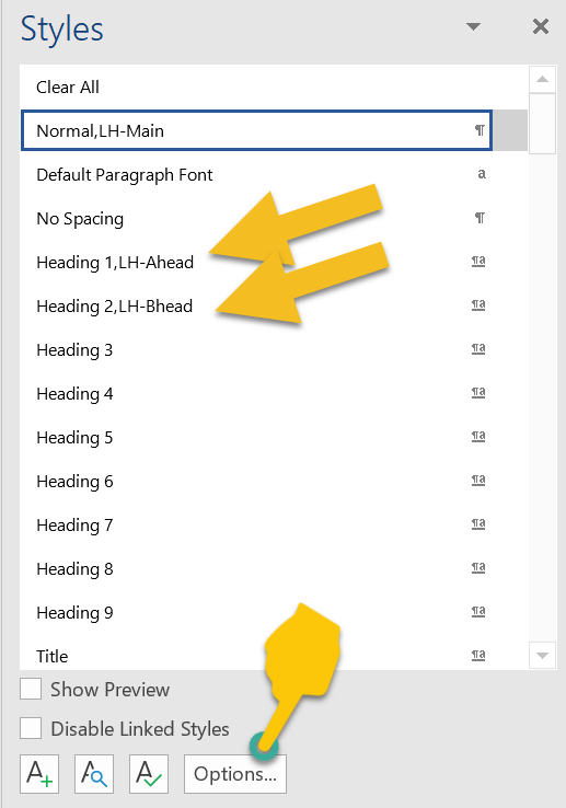
Check the HIDE BUILT-IN NAME WHEN ALTERNATE EXISTS box, then left-click on OK.
Your list will now display with your modified names.

Heading styles and navigating your Word file
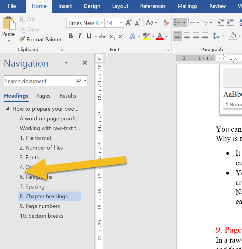
One of the advantages of using the Styles tool for a novel is navigation.
To access the Navigation pane, press CTRL F on a PC. Now, left-click on the HEADINGS tab. Any style based on one of the in-built heading styles will show up in the menu.
One of the advantages of using the Styles tool for a novel is navigation.
To access the Navigation pane, press CTRL F on a PC. Now, left-click on the HEADINGS tab. Any style based on one of the in-built heading styles will show up in the menu.
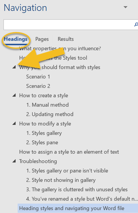
I use this function when I’m editing and want to check that chapter headings (and subheadings) are formatted consistently, assigned the correct level of priority, and numbered chronologically.
Headings with arrows next to them indicate lower-level subheadings. You can expand or collapse subheadings by left-clicking on the arrows.
Furthermore, if you want to shift a headed or subheaded section to another position in your document, left-click on the relevant heading and drag up or down the menu.
Summing up
Styles let you focus on your writing rather than fretting about internal text design.
Applying a style to an element of your book file takes a fraction of the time required for manual formatting. And because any style can be tweaked, you get to change your mind as often as you like.
If you have any problems with using Word’s Styles gallery and pane, drop me a note in the comments and I’ll do my best to fix the issue.
Fancy watching a video tutorial? Visit my YouTube channel and watch: Self-editing Your fiction in Word: How to Use Styles.
Louise Harnby is a line editor, copyeditor and proofreader who specializes in working with crime, mystery, suspense and thriller writers.
She is an Advanced Professional Member of the Chartered Institute of Editing and Proofreading (CIEP), a member of ACES, a Partner Member of The Alliance of Independent Authors (ALLi), and co-hosts The Editing Podcast.
Visit her business website at Louise Harnby | Fiction Editor & Proofreader, say hello on Twitter at @LouiseHarnby, connect via Facebook and LinkedIn, and check out her books and courses.
She is an Advanced Professional Member of the Chartered Institute of Editing and Proofreading (CIEP), a member of ACES, a Partner Member of The Alliance of Independent Authors (ALLi), and co-hosts The Editing Podcast.
Visit her business website at Louise Harnby | Fiction Editor & Proofreader, say hello on Twitter at @LouiseHarnby, connect via Facebook and LinkedIn, and check out her books and courses.
In this article, I offer 12 tips on how to make your book file editor-ready.
Interior book design is something that should be carried out after your book’s been edited, not before.
If you’re creating a printed book, post-design page proofs are perfect for the proofreader because they can check not only your spelling, punctuation and grammar but also the layout.
Page proofs are either hard-copy or PDF versions of the book that are laid out exactly as they will appear in the final printed version.
You and your proofreader will be looking at what the reader would see if they were to walk into a bookshop, pull the title off the shelf and browse through the pages … almost. The proofreader’s job is to ensure that any final errors and layout problems have been attended to before the book is printed.
For a comprehensive overview of what needs to be attended to when proofreading designed page proofs, read this (available free when you sign up to The Editorial Letter): Proofreading checklist: How to check page proofs like a professional.
With copyediting (and proofreading raw-text files for digital books), it’s a different story ...
Working with raw-text files
If you are asking a professional editor to work on the raw text of your book, follow these 12 recommendations to ensure that the file is editor-friendly.
The good news is this: it means less work for you, not more, because you’re not having to design anything … not yet, anyway.
1. File format
Most professional fiction editors work in Microsoft Word. That’s because, despite the odd glitch, it’s still the best word-processing software on the planet.
It has a range of excellent onboard tools that help your editor style the various elements of your text consistently, and quickly locate potential problems that might need fixing.
Word is compatible with a host of macros that complement the editor’s brain and eye. That means they can add an extra level of quality-control to the edit efficiently.
Even if you’ve written your book in a different program – for example, Scrivener, Google Docs or Apple Pages – place the text in a Word file before you send it to your editor. You’ll get a better-quality book edit, I promise.
2. Number of files
Unless you’ve agreed with your book editor to work serially – i.e. on a chapter-by-chapter basis – create a single master file that contains the full text of your novel.
If you send them 75 separate chapters, all they’ll do is combine them into one file … after they’ve finished weeping with frustration.
Editors want to ensure that your book is consistent – that Kathyrn doesn’t become Katherine, Catherine or Cathryn. There are Word plug-ins that can help them identify problems like this efficiently but they’re only effective if the editor is working with a single file.
The same applies to ensuring that the various elements of your text are formatted consistently. For example, it’s conventional for the first paragraph in a chapter or section to be full-out (not indented). Your editor can use Word’s styles palette to define the appearance of a first paragraph.
Once the style has been set, it’s a case of applying it to every relevant paragraph in the file. If they don’t have a master file to work with, they’ll have to create a new style for each one of your 75 chapters or import that style for the same.
Fiction editors love master files, and they will love you if that’s what you provide.
3. Fonts
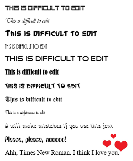
You might have decided to use an unconventional font for your book interior. You’re perfectly entitled to use any font you choose ... just spare a thought for your editor’s eyes.
When it comes to the editing stage, stick to something like Times New Roman, size 14. It’s a serif font, which means it’s easy on the eye. The less your editor struggles to read the text, the better the quality of their work.
Working with raw-text files
If you are asking a professional editor to work on the raw text of your book, follow these 12 recommendations to ensure that the file is editor-friendly.
The good news is this: it means less work for you, not more, because you’re not having to design anything … not yet, anyway.
1. File format
Most professional fiction editors work in Microsoft Word. That’s because, despite the odd glitch, it’s still the best word-processing software on the planet.
It has a range of excellent onboard tools that help your editor style the various elements of your text consistently, and quickly locate potential problems that might need fixing.
Word is compatible with a host of macros that complement the editor’s brain and eye. That means they can add an extra level of quality-control to the edit efficiently.
Even if you’ve written your book in a different program – for example, Scrivener, Google Docs or Apple Pages – place the text in a Word file before you send it to your editor. You’ll get a better-quality book edit, I promise.
2. Number of files
Unless you’ve agreed with your book editor to work serially – i.e. on a chapter-by-chapter basis – create a single master file that contains the full text of your novel.
If you send them 75 separate chapters, all they’ll do is combine them into one file … after they’ve finished weeping with frustration.
Editors want to ensure that your book is consistent – that Kathyrn doesn’t become Katherine, Catherine or Cathryn. There are Word plug-ins that can help them identify problems like this efficiently but they’re only effective if the editor is working with a single file.
The same applies to ensuring that the various elements of your text are formatted consistently. For example, it’s conventional for the first paragraph in a chapter or section to be full-out (not indented). Your editor can use Word’s styles palette to define the appearance of a first paragraph.
Once the style has been set, it’s a case of applying it to every relevant paragraph in the file. If they don’t have a master file to work with, they’ll have to create a new style for each one of your 75 chapters or import that style for the same.
Fiction editors love master files, and they will love you if that’s what you provide.
3. Fonts
You might have decided to use an unconventional font for your book interior. You’re perfectly entitled to use any font you choose ... just spare a thought for your editor’s eyes.
When it comes to the editing stage, stick to something like Times New Roman, size 14. It’s a serif font, which means it’s easy on the eye. The less your editor struggles to read the text, the better the quality of their work.
4. Colours
I recommend you use black text on a white page. Again, it’s about readability.
The white text on the coloured blocks below certainly stands out, and the contrast is visually appealing, but for editing purposes it’s a challenge.
I recommend you use black text on a white page. Again, it’s about readability.
The white text on the coloured blocks below certainly stands out, and the contrast is visually appealing, but for editing purposes it’s a challenge.
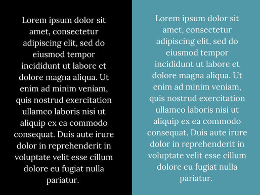
A couple of years ago, I was asked to copyedit a fabulous book for an indie author. The pages were black, the text pink. The first thing I asked him – no, begged him – was for permission to change the file’s appearance to something more conventional.
He agreed to save the quirky colourway for the design stage and I was immensely grateful. So was he. I’d have had to increase my price because I would have edited more slowly.
5. Paragraphs
Open any novel on your bookshelf and it’s likely you’ll see a text layout something like this:
He agreed to save the quirky colourway for the design stage and I was immensely grateful. So was he. I’d have had to increase my price because I would have edited more slowly.
5. Paragraphs
Open any novel on your bookshelf and it’s likely you’ll see a text layout something like this:
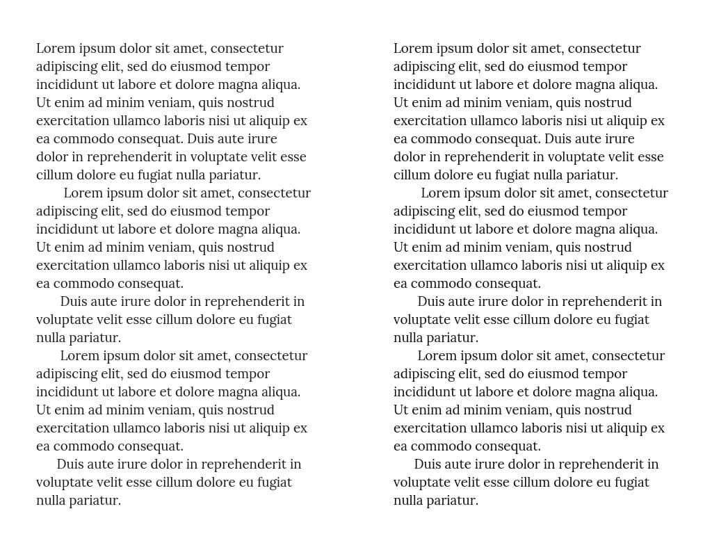
Those indented paragraphs are not made using the tab key. Instead, use Word’s ribbon to create proper indents.
To find out how to create a body-text style with proper indents, watch this video tutorial: Self-editing your fiction in Word: How to use styles.
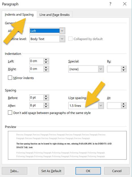
6. Spacing
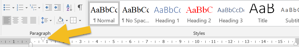
At line and copyediting stage, don’t worry about how many pages your text covers. Instead, give your editor a file with the lines spaced so that the text is easy to read. Setting the line spacing at 1.25 or 1.5 works well for a font size of 12 or 14.
The line spacing function can be located by right-clicking on text and selecting PARAGRAPH. A window will open. Make sure you’re in the INDENTS AND SPACING tab. Then amend the LINE SPACING field.
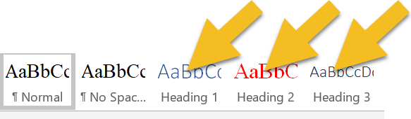
7. Chapter headings
Your editor will adore you if you assign your chapter headings with one of Word’s heading styles:
Your editor will adore you if you assign your chapter headings with one of Word’s heading styles:
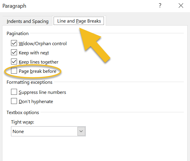
You can even modify the style so that it automatically starts on a fresh page.
Right-click on the heading style, select MODIFY, then FORMAT, then PARAGRAPH. A window will open. Make sure you’re in the LINE AND PAGE BREAKS tab. Check the PAGE BREAK BEFORE box.
Right-click on the heading style, select MODIFY, then FORMAT, then PARAGRAPH. A window will open. Make sure you’re in the LINE AND PAGE BREAKS tab. Check the PAGE BREAK BEFORE box.
Why is this useful?
- It means you won’t need to hit the return button 23+ times to get the cursor to the top of the next page when you begin a new chapter.
- You’ll provide your editor with a quick way of ensuring that all chapters are listed chronologically because they’ll appear in a list in Word’s Navigation menu. If your chapters are numbered, any problems will be easy to identify.
8. Page numbers
In a raw-text work of fiction, there’s no need for page numbers or other headers and footers.
Word records the page number in the bottom-left-hand corner of the screen of a PC, and that’s what an editor will refer to if they need to direct your attention to a specific page.
In a raw-text work of fiction, there’s no need for page numbers or other headers and footers.
Word records the page number in the bottom-left-hand corner of the screen of a PC, and that’s what an editor will refer to if they need to direct your attention to a specific page.
If you plan to upload a later version of your file for ebook creation, your page numbers will need to be removed anyway.
If you’re printing, save the page numbering for design stage.
9. Section breaks
I recommend introducing three asterisks (***) to indicate a section break. You can change them at design stage of course, but they’re handy at editing stage because your editor can see that you intend for there to be a section break.
Why not just have a line space? Because sometimes a writer will accidentally hit the return button twice. Your editor will have to spend time working out whether the break is intended rather than focusing on the flow of your text and any errors that need correcting.
10. Pictures/images
If your editor needs to check copy against images and their captions, consider placing these in a separate file.
Images, especially high-resolution ones, will increase the size of your book file massively, and slow down refreshing when the editor saves. And your editor will save once every few seconds.
Sounds bonkers, doesn't it? But the editor who doesn't save regularly is the editor who finds they've lost a precious half-hour's worth of editing because there was a power cut, or a hurricane, or the oven exploded, or whatever.
And when they come to email your edited file full of hi-res images, it will be so huge that they'll have to use an external cloud-based transfer service. The file will take an hour to load (unless they have rubbish broadband speed, in which case it will take two or three hours).
They'll do the transfer in the evening so that it doesn't slow them down while they're working, meaning their teenage kid will start moaning and giving them that look because Netflix is buffering or Minecraft won't load, or something equally devastating. Save us, I beg you.

On top of all that, amendments, deletions, and additions to the text will cause your carefully placed images to shift into spaces you didn't intend. Better to leave image placement to interior-design stage. It'll save you and your editor time and tears.
11. Manual tables of contents
If you've created a table of contents in a Word file prior to copyediting, there's a good chance that a chunk of your page numbers and some of the chapter titles will be wrong by the time your editor has finished.
Of course, you can pay them to fix these too. But that could add an extra hour's work onto your bill. Worse, you'll be wasting your money because when the book's interior is designed, everything will change again.
I know this because when I proofread for publishers (and that means I'm working on designed page proofs that have been edited multiple times and designed by a professional interior formatter) the table of contents is always messed up.
Sort out your table of contents before you do your final design, not at copyediting stage. It'll save you money, I promise.
12. Manual index
I'm adding this one in for non-fiction writers, just in case you're reading.
If the page numbers against a table of contents get messed up during copyediting, the damage to an index is nothing short of catastrophic.
It's not just the page numbers, but the indexed entries too. Spellings might change, so might compound hyphenation. Some key terms will have been removed or changed. Others will have been added.
Indexing should come after proofreading, ideally, but certainly not at copyediting stage.
Summing up
These are just suggestions, not book law, editing law, any kind of law. However, your editor will love you if you make life easier for them, not because they’re lazy but because they want to focus on making your narrative and dialogue sing rather than formatting text so that it’s readable.
There’s absolutely a time and a place for great interior design, but pre-editing stage is not it. Save yourself the bother and keep it simple.
For more raw-text tidy-up tips, grab this free booklet: Formatting in Word: Find and Replace.
Fancy watching a video instead? Here’s where to find the free tutorial.
Louise Harnby is a line editor, copyeditor and proofreader who specializes in working with crime, mystery, suspense and thriller writers.
She is an Advanced Professional Member of the Chartered Institute of Editing and Proofreading (CIEP), a member of ACES, a Partner Member of The Alliance of Independent Authors (ALLi), and co-hosts The Editing Podcast.
FIND OUT MORE
> Get in touch: Louise Harnby | Fiction Editor & Proofreader
> Connect: Twitter at @LouiseHarnby, Facebook and LinkedIn
> Learn: Books and courses
> Discover: Resources for authors and editors
If you're proofreading final designed page proofs, there's more to look out for than the odd typo or double space. Professional proofreaders identify and find solutions to a range of layout problems too.
This post featured in Joel Friedlander's Carnival of the Indies #84
.
Who's this checklist for?
This is for anyone checking final designed page proofs. For example:
I've proofread over 500 books for the mainstream publishing industry. The checklist below is based on the house guidelines provided by the publishers I've worked for.
The titles I've proofread include social science textbooks, handbooks and monographs, and works of fiction and narrative non-fiction. And while the subject matter has varied, the requirements for checking final page proofs hasn't.
Note my use of the term 'final designed page proofs'. This checklist is not for those doing a final quality-control check in a Word document. Rather, we're dealing with a typeset PDF or hardcopy of the book as it will appear when printed or published online.
For that reason, the proofreader is tasked with ensuring that the appearance of the book is consistent and correct according to client preference. This PDF provides a summary of the required checks.
To get a free copy, sign up to The Editorial Letter, monthly news about fiction editing and editorial business growth.
Who's this checklist for?
This is for anyone checking final designed page proofs. For example:
- self-publishing authors preparing for print-on-demand. Use this when working through the PDF generated by the likes of CreateSpace or Bookbaby.
- business owners producing PDF or printed reports, booklets, manuals or ebooks. Use this to check your file before it's distributed to your clients or uploaded to your website.
- professional proofreaders. Use this to check page proofs for your publisher clients and independent authors.
I've proofread over 500 books for the mainstream publishing industry. The checklist below is based on the house guidelines provided by the publishers I've worked for.
The titles I've proofread include social science textbooks, handbooks and monographs, and works of fiction and narrative non-fiction. And while the subject matter has varied, the requirements for checking final page proofs hasn't.
Note my use of the term 'final designed page proofs'. This checklist is not for those doing a final quality-control check in a Word document. Rather, we're dealing with a typeset PDF or hardcopy of the book as it will appear when printed or published online.
For that reason, the proofreader is tasked with ensuring that the appearance of the book is consistent and correct according to client preference. This PDF provides a summary of the required checks.
To get a free copy, sign up to The Editorial Letter, monthly news about fiction editing and editorial business growth.
Louise Harnby is a line editor, copyeditor and proofreader who specializes in working with crime, mystery, suspense and thriller writers.
She is an Advanced Professional Member of the Chartered Institute of Editing and Proofreading (CIEP), a member of ACES, a Partner Member of The Alliance of Independent Authors (ALLi), and co-hosts The Editing Podcast.
She is an Advanced Professional Member of the Chartered Institute of Editing and Proofreading (CIEP), a member of ACES, a Partner Member of The Alliance of Independent Authors (ALLi), and co-hosts The Editing Podcast.
- Get in touch: Louise Harnby | Fiction Editor & Proofreader
- Connect: Twitter at @LouiseHarnby, Facebook and LinkedIn
- Learn: Books and courses
- Discover: Resources for authors and editors
‘A good design should be almost invisible. It should support your words, deliver them to the reader, not get in the way.’
Rebecca Brown, Design for Writers
Rebecca Brown, Design for Writers
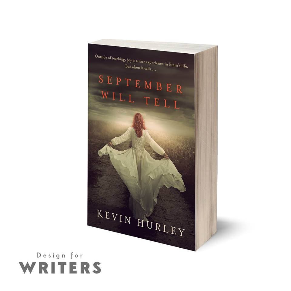
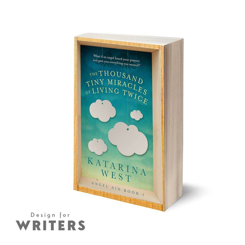
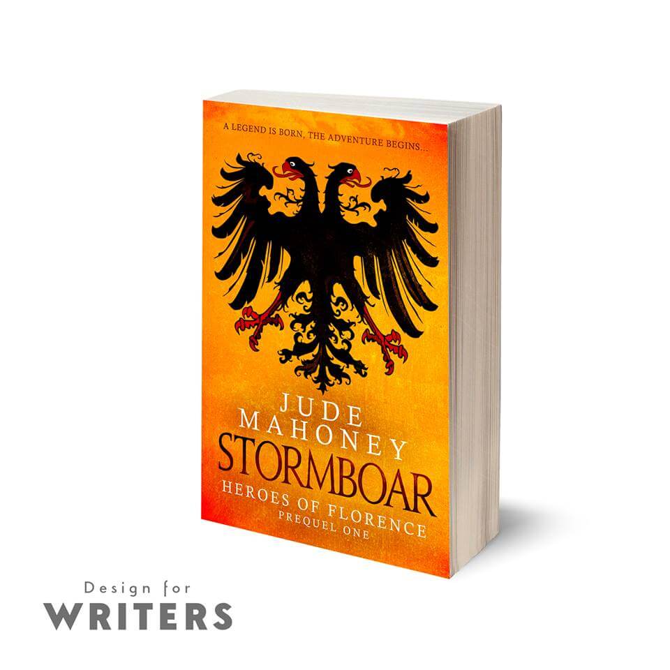
I'm delighted to welcome Rebecca Brown of Design for Writers to the Proofreader's Parlour. Design for Writers is the team I refer my authors to when they ask for help with book formatting and design.
In this post, Rebecca offers her expert advice on how to get the best from your book interior ...
In this post, Rebecca offers her expert advice on how to get the best from your book interior ...
Congratulations! Having shed blood, sweat and tears, and arrived at a finished manuscript, you’ve decided to take the plunge and self-publish.
As part of the process of finding the best people to help you do that, one of your priorities will be making your book look as professional as possible.
Everyone’s heard the saying ‘Don’t judge a book by its cover’. Yet most people do just that. And they judge it by how it looks inside, too.
The cover will get people to pick your book off the shelf; the interior will help make it a pleasure to read.
Why is interior design important?
Your words have been carefully edited and chosen to hook your readers, but the best opening lines may never even be read if they’re set in a font that’s difficult to read, the margins are so small that you need to crack the spine just to read the start of each line, or the overall design looks rushed and unprofessional.
Many self-published authors rely on online sales of both print books and ebooks though, so, okay, a badly designed book might not necessarily put off all prospective buyers. But do you want your readers to leave reviews saying, ‘I don’t know if this book was any good because it was horrible to read’?
It does happen, just as readers will leave reviews that criticize poor editing or a weak story line. And those readers are less likely to return for Book Two.
What does a well-designed book look like?
The best way of answering that is to look at some professionally published books. This is what you’ll find.
Text: The text is large enough to read – usually around 11 or 12 point – but not too large (unless it’s a large-print edition) of course; the point is that the text size is appropriate for the target audience.
Margins: There’s plenty of space around the text. You don’t want tiny margins; you need to be able to see the text as it goes in towards the spine, and you need to be able to hold it around the edges without your thumb obscuring the words. Some titles will have bigger margins, like children’s books. Again, it’s about an appropriate design for your readership.
Typeface: The most obvious and striking feature is the chosen typeface. It should be a serif font (like Garamond, or Times) not a sans-serif font (like Arial) for the body text.
Serif fonts are easier on the eyes for long format, physical text. Sans-serif fonts are easier for on-screen reading on a computer. However, this itself can depend on the type of book – many people prefer a sans-serif for some kinds of non-fiction.
For fiction, though, choose a traditional serif font. That way, if you need to make part of the text stand out – for example, if your protagonists exchange text messages, it’ll be more obvious that you’ve made a deliberate style choice, and have a more professional impact.
When it comes to print books, small details like embellishments and display fonts for titles all add to the pleasure of reading, and to the sense of your book as a beautiful piece of work.
That doesn’t mean you should try to mimic the same experience in your ebook, though …
|
|
|
Print and digital books are different animals
Authors often hugely underestimate just how different ebooks and print are.
Don’t aim for a duplicate of your print book – it’s a different reading experience. A stand-out feature of ebooks is the extent to which the reader can set up the reading experience to fit their personal preferences (for example, text size, font, and spacing).
If you try to force a replica of your print book, you’re doing your book a disservice and making things more difficult for your reader.
For example, every ebook device is slightly different, so if you have many different embellishments and beautiful fonts, you’re increasing the risk of the book not displaying as you intended, perhaps not working properly at all.
Doing it yourself
Authors can, and often do, carry out the work themselves. There are many good guides to setting out your text, and if you bear certain guidelines in mind, such as those mentioned above, you’ll be able to produce a decent book.
If your budget is limited, this can be a good option. Bear in mind the following:
Print
Ebook
Print and digital books are different animals
Authors often hugely underestimate just how different ebooks and print are.
Don’t aim for a duplicate of your print book – it’s a different reading experience. A stand-out feature of ebooks is the extent to which the reader can set up the reading experience to fit their personal preferences (for example, text size, font, and spacing).
If you try to force a replica of your print book, you’re doing your book a disservice and making things more difficult for your reader.
For example, every ebook device is slightly different, so if you have many different embellishments and beautiful fonts, you’re increasing the risk of the book not displaying as you intended, perhaps not working properly at all.
Doing it yourself
Authors can, and often do, carry out the work themselves. There are many good guides to setting out your text, and if you bear certain guidelines in mind, such as those mentioned above, you’ll be able to produce a decent book.
If your budget is limited, this can be a good option. Bear in mind the following:
- You’ll need decent word-processing software, preferably with the facility to export your file to PDF (so you retain more control over the finished look), and you'll need to set up the pages in your final trim size.
- If your book is 5.25" x 8" (a great size for a novel!) then don’t format your text in A4.
- Take your time and try to envisage your book in your hands.
Ebook
- Make sure that none of your text is in Default styling; it all has to be in a ‘Paragraph’ (i.e, Body) or ‘Character’ (i.e, Italic) style; ideally you want to keep these styles to a minimum.
- Strip out unnecessary spacing (multiple returns are a cardinal sin, and your ebook-conversion service will purge them with utter contempt, so your book won’t look how you thought it would anyway!)
- Ensure the text is justified.
Hiring a professional
While you can do it yourself, there is a risk that you'll miss out those extra design elements that make your book stand out.
Hiring pro interior designers ensures that your files are absolutely guaranteed to work with the major retailers, and that your book will offer your readers the best reading experience possible, regardless of format (e.g. paperback, hardback, ereader).
So what should you look for?
Price is always a consideration of course. This can be an expensive endeavour, but sometimes you do get what you pay for, and cheaper is not necessarily better.
Look for what’s included in the package:
For print, at least, the designer’s use of InDesign demonstrates a level of skill and commitment to using professional tools.
Ask to see examples of your prospective formatter work. Find out what books they’ve worked on (from their website or social media, for example) and take a look at the ‘Look Inside’ feature on Amazon, noting the following:
Evaluating the professional designer’s process
It’s important to understand how your designer works if you’re to get the best value for your investment. If they’re not interested in getting to know your book and your style, that should be a red flag.
Ask them how they would like your manuscript to be sent to them. Most will want final, fully edited text in a common format (such as a Microsoft Word document), but often they’ll allow a ‘reasonable’ number of small changes after proof stage. That’s because designers are human, too! We realize that seeing your work laid out for the first time can alert you to small typos and errors, no matter how carefully you’ve checked it.
However, multiple rounds of editing once the text is laid out can have a bigger impact than you might think, so get it as close to finished as you possibly can, and make sure you understand what levels of revision are included by your formatter.
Finally, and this goes for any book-publication service, think about your initial contact with them. What are they like to work with? There’ll be quite a lot of back-and-forth. Discussion is important because this is such a personal, important project for you. Having a great rapport with your designer is essential.
Good luck!
While you can do it yourself, there is a risk that you'll miss out those extra design elements that make your book stand out.
Hiring pro interior designers ensures that your files are absolutely guaranteed to work with the major retailers, and that your book will offer your readers the best reading experience possible, regardless of format (e.g. paperback, hardback, ereader).
So what should you look for?
Price is always a consideration of course. This can be an expensive endeavour, but sometimes you do get what you pay for, and cheaper is not necessarily better.
Look for what’s included in the package:
- Will your files be guaranteed?
- Will your ebooks be validated by latest IDPF standards?
- Which programme does your formatter use?
For print, at least, the designer’s use of InDesign demonstrates a level of skill and commitment to using professional tools.
Ask to see examples of your prospective formatter work. Find out what books they’ve worked on (from their website or social media, for example) and take a look at the ‘Look Inside’ feature on Amazon, noting the following:
- Is the front matter laid out well?
- What does the title page look like?
- Does the interior complement the cover design?
Evaluating the professional designer’s process
It’s important to understand how your designer works if you’re to get the best value for your investment. If they’re not interested in getting to know your book and your style, that should be a red flag.
Ask them how they would like your manuscript to be sent to them. Most will want final, fully edited text in a common format (such as a Microsoft Word document), but often they’ll allow a ‘reasonable’ number of small changes after proof stage. That’s because designers are human, too! We realize that seeing your work laid out for the first time can alert you to small typos and errors, no matter how carefully you’ve checked it.
However, multiple rounds of editing once the text is laid out can have a bigger impact than you might think, so get it as close to finished as you possibly can, and make sure you understand what levels of revision are included by your formatter.
Finally, and this goes for any book-publication service, think about your initial contact with them. What are they like to work with? There’ll be quite a lot of back-and-forth. Discussion is important because this is such a personal, important project for you. Having a great rapport with your designer is essential.
Good luck!
Rebecca’s top tip
Whether you’re doing it yourself or paying someone, keep it simple! Your text is what the reader’s bought, so a good design should be almost invisible. It should support your words, deliver them to the reader, not get in the way.
Design for Writers
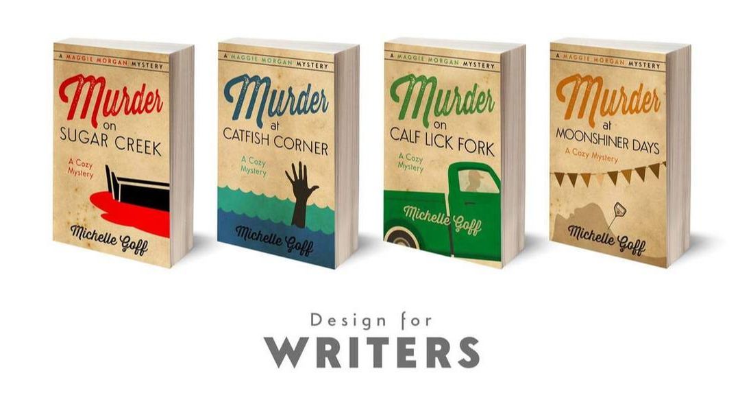
For drama-free book design, contact Rebecca or Andrew at [email protected] or www.designforwriters.com
For drama-free book design, contact Rebecca or Andrew at [email protected] or www.designforwriters.com
Louise Harnby is a line editor, copyeditor and proofreader who specializes in working with crime, mystery, suspense and thriller writers.
She is an Advanced Professional Member of the Chartered Institute of Editing and Proofreading (CIEP), a member of ACES, a Partner Member of The Alliance of Independent Authors (ALLi), and co-hosts The Editing Podcast.
Visit her business website at Louise Harnby | Fiction Editor & Proofreader, say hello on Twitter at @LouiseHarnby, connect via Facebook and LinkedIn, and check out her books and courses.
Chris Hamilton-Emery, co-founder of Salt, discusses what makes a great book cover.
This post featured in Joel Friedlander's Carnival of the Indies #82
Managing the process of book cover design
So you’ve written, edited and prepared your book’s interior for your preferred distribution channels.
Now you need the cover. And, as I know all too well, being able to write in no way qualifies one for being able to design.
When we’re self-publishing, there are some parts of the process that are, for most of us, best bought in. When it comes to book jackets and digital covers, that means talking to a designer.
Whether you decide to do it yourself or hire a designer will depend on your budget. Either way there are some design basics that are well worth bearing in mind to help you make your book wow itself.
Great words compel your readers to finish your book ... A great cover compels them to start it.
Chris Hamilton-Emery, design director of The Cover Factory and co-founder of the gorgeous independent publisher Salt (based here in mostly sunny Norfolk!) has been kind enough to share his expertise (and his fantastic sense of humour!).
The advice below will help both the self-publisher and those looking for publishing contracts. Chris's core mantra? Avoid being dull.
Design by committee
For authors with a publishing contract, it’s not uncommon for a team to be involved in briefing a designer – they may not be acting as a team, but there’s often one involved.
... A sales manager who has her eye on that cover that’s on display in Book Bonanza’s shop window.
... The marketing manager who keeps up with the new trends and the language around covers: ‘It needs some spacy calmness for the furniture to show up the title text.’
... Perhaps the bookseller: ‘Put a snake on it in a herby sort of border.’
... The managing director: “We don’t do serifs or colour at Gubbins & Potsdamer.”
... And then there’s the production manager, the print buyer, the design manager. Everyone has something to add to the sauce, not least an expectation of stellar sales.
Then someone rings the author. “He says blue reminds him of his dead mother, and the goat is the wrong breed.”
Which all goes to say that cover design has its contexts.
The person that truly matters is, of course, the reader – yet a cover has many important audiences before we reach that goal. That’s because it’s the chief means by which people make their investments in the book in the supply chain long before the bound paper book block (or its digital sister) touches the shelves.
A cover signals commitment from the publisher (even if that publisher is you, the author); it signals desire among booksellers; it signals prospects among the supply chain, and its critics and reviewers. Many will be spending their money before anyone has read a word.
For those with publishing contracts, it’s entirely possible that the author will have no contractual say in the matter, though few publishers would be brave enough to go to press with a cover that an author despised.
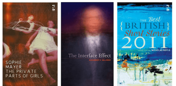
To boldly go?
Many covers are compromises and copies, and covers, like many parts of our modern lives, are influenced by fashion.
A cover that breaks ranks and stands out has as much chance of failure as success and so many covers play it safe. Being bold can also mean being ignored. As one friend put it, ‘The cutting edge is also the bleeding edge.’
Some markets have their own design universes, like crime, or romance – and it will take a brave soul to depart from the conventions of the genre.
Yet we all aspire to good cover design, and we all recognize that in the fiercely competitive environment of today’s global book trade, a cover can really help make a book work, by which we mean, distinguish itself.
Whomever compiles the brief has no easy task; they will be serving the multiple masters listed above and trying to find a way forward to inspire a designer to deliver a pot of gold in the shape of a small rectangle.
The brief
Do provide a synopsis, but not necessarily the entire book
List three powerful visual moments. List one or two key visual themes. If the book had a palette, of which colours would it be comprised? How would you like readers to react to it?
Do not ask for your entire book to be illustrated on the cover
‘There must be a gold sky with twenty-six ravens, and a golf house, a small bus, traffic cones and a trifle, but no jelly. And on the trestle tables, bunting. And a seal. There are two main characters, one tall, the other taller, each has a mole. They are wearing jacquard ties. They must be shown in front of the thirty-seven villagers, all attempting to get into a train. The train is going to Doncaster.’ Hmm.
Detail is the great enemy of good design.
Yet so, too, is needless abstraction. ‘Can it be wavy green with splashy washy bits? Except blue.’
Inspiring a great design can frequently be found in seeking out the monolithic and iconic message a successful cover often presents, ‘If she had eyes, they would be stones.’ Leave plenty of room for the designer to imagine, to take risks, and above all to surprise you with their own art.
Never ask a designer to work up your own ideas. If you have ideas, especially strong ones, express them as visual journeys. Don’t offer destinations.
Ask questions
Perhaps the best way to ask questions is to show things that you believe work for you – other covers that appeal, especially ones relevant to the text.
Create a visual space for the designer to work in, and add your brief to provide context and challenges.
Good questions expose the problem, good questions get to the central, even the reductive, theme of the book. ‘If there was ever a home like this, it would be a songless house on a wet hill with a red rat at its heart.’
So, again, ask for three visuals, perhaps some early sketches, to see where things are leading. Or be bold and say, I am prepared to be surprised.
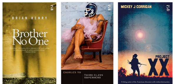
Consider the compulsion factor
It’s also important to know the mechanics of a cover – once it’s passed through its committees and is en route to the bookstore, its role really comes into its own.
Among the tens of thousands of books being put in front of readers, in stores or online, the cover’s job is simply to attract the browser, that momentous millisecond of compulsion that makes someone pick the book up, read the blurb and break open the spine. Or scroll down a page and click Look Inside.
Think of it. You spot something, your eye stops its movement, you lean forward and pick up the book, you turn it over and read an endorsement, your eye flickers, you read down. Ah, it’s about the last water mill in a land of drought ... You open the book and a journey begins (one that starts at the till).
Think back. The cover merely had to stop you moving on and its work was almost done – such a simple and perplexing thing. Would something more complicated have worked better? Something less fussy? Something less drab?
The essentials ...
Not everyone can afford a £3,000 cover budget; nor are they willing to have a six-month internal circulation list for everyone to argue over within a publishing house.
You may be going it alone; you may be self-publishing.
The problems are still the same – your cover must be distinctive, distinguishable, memorable, singular and arresting.
Free fonts can help in devising sketches. Test your ideas out with professionals. Don’t test them out with friends.
Look at your cover in the context of your competitors.
And give it time. If you’ve spent years writing your book, at least give a few months to considering the cover.
Be aware of your own prejudices. Be aware of your own tastes.
Pay attention to space and position, to colour and clarity.
And if your book is to be printed, above all, remember the spine, for this is what most readers will see.
Don’t mistake a poverty of design as the representation of authenticity. Don’t over elaborate, either. Look at your cover from twelve feet away; can you recognize it, read it?
It’s also important to know the mechanics of a cover – once it’s passed through its committees and is en route to the bookstore, its role really comes into its own.
Among the tens of thousands of books being put in front of readers, in stores or online, the cover’s job is simply to attract the browser, that momentous millisecond of compulsion that makes someone pick the book up, read the blurb and break open the spine. Or scroll down a page and click Look Inside.
Think of it. You spot something, your eye stops its movement, you lean forward and pick up the book, you turn it over and read an endorsement, your eye flickers, you read down. Ah, it’s about the last water mill in a land of drought ... You open the book and a journey begins (one that starts at the till).
Think back. The cover merely had to stop you moving on and its work was almost done – such a simple and perplexing thing. Would something more complicated have worked better? Something less fussy? Something less drab?
The essentials ...
Not everyone can afford a £3,000 cover budget; nor are they willing to have a six-month internal circulation list for everyone to argue over within a publishing house.
You may be going it alone; you may be self-publishing.
The problems are still the same – your cover must be distinctive, distinguishable, memorable, singular and arresting.
- Stock art can provide a basis, but rarely a solution, to your needs.
- Typography should be clear and maintain some personality.
- Avoid a title top, a box for an illustration and your name at the bottom.
- Avoid the reverse, too.
- Above all, go into a bookstore and look at covers. Lots of them. What’s going on in the world of covers? What are the expectations? Know your market and address it. Understand who the readers are.
Free fonts can help in devising sketches. Test your ideas out with professionals. Don’t test them out with friends.
Look at your cover in the context of your competitors.
And give it time. If you’ve spent years writing your book, at least give a few months to considering the cover.
Be aware of your own prejudices. Be aware of your own tastes.
Pay attention to space and position, to colour and clarity.
And if your book is to be printed, above all, remember the spine, for this is what most readers will see.
Don’t mistake a poverty of design as the representation of authenticity. Don’t over elaborate, either. Look at your cover from twelve feet away; can you recognize it, read it?
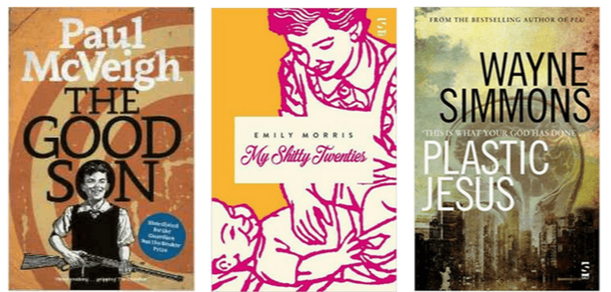
Working with the designer ...
Let’s roll back through these notes towards a design. If we’re using a designer, we want to enthuse and inspire, we want to ignite not instruct. We want to understand the context in relation to other covers.
We want to be aware of those who will put our book in front of readers.
We want the readers to pick it up or click on it.
Whether we use a designer or produce something ourselves, we are all chasing something singular, clear and memorable. We are avoiding complexity. We are signifying the book more than illustrating its contents.
Above all we are branding it.
Remember that brands symbolise and represent complicated relationships and stories by simple means.
Simple doesn’t mean dull. In fact, perhaps the best mantra is, don't be dull. The world needs its little moments of glamour.
Louise Harnby is a line editor, copyeditor and proofreader who specializes in working with crime, mystery, suspense and thriller writers.
She is an Advanced Professional Member of the Chartered Institute of Editing and Proofreading (CIEP), a member of ACES, a Partner Member of The Alliance of Independent Authors (ALLi), and co-hosts The Editing Podcast.
Visit her business website at Louise Harnby | Fiction Editor & Proofreader, say hello on Twitter at @LouiseHarnby, connect via Facebook and LinkedIn, and check out her books and courses.
She is an Advanced Professional Member of the Chartered Institute of Editing and Proofreading (CIEP), a member of ACES, a Partner Member of The Alliance of Independent Authors (ALLi), and co-hosts The Editing Podcast.
Visit her business website at Louise Harnby | Fiction Editor & Proofreader, say hello on Twitter at @LouiseHarnby, connect via Facebook and LinkedIn, and check out her books and courses.

PDF MARKUP
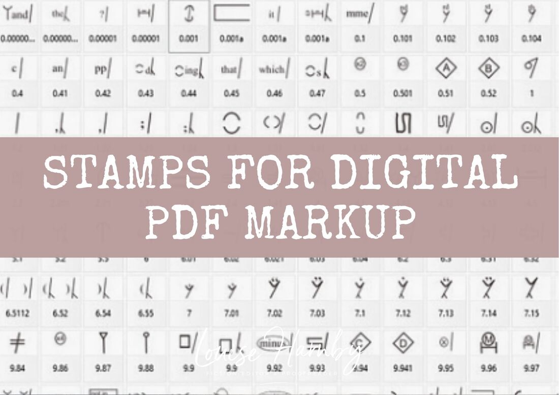
AUTHOR RESOURCES
EDITOR RESOURCES
TESTIMONIALS
Dare Rogers
'Louise uses her expertise to hone a story until it's razor sharp, while still allowing the author’s voice to remain dominant.'
Jeff Carson
'I wholeheartedly recommend her services ... Just don’t hire her when I need her.'
J B Turner
'Sincere thanks for a beautiful and elegant piece of work. First class.'
Ayshe Gemedzhy
'What makes her stand out and shine is her ability to immerse herself in your story.'
Salt Publishing
'A million thanks – your mark-up is perfect, as always.'
CATEGORIES
All
Around The World
Audio Books
Author Chat
Author Interviews
Author Platform
Author Resources
Blogging
Book Marketing
Books
Branding
Business Tips
Choosing An Editor
Client Talk
Conscious Language
Core Editorial Skills
Crime Writing
Design And Layout
Dialogue
Editing
Editorial Tips
Editorial Tools
Editors On The Blog
Erotica
Fiction
Fiction Editing
Freelancing
Free Stuff
Getting Noticed
Getting Work
Grammar Links
Guest Writers
Indexing
Indie Authors
Lean Writing
Line Craft
Link Of The Week
Macro Chat
Marketing Tips
Money Talk
Mood And Rhythm
More Macros And Add Ins
Networking
Online Courses
PDF Markup
Podcasting
POV
Proofreading
Proofreading Marks
Publishing
Punctuation
Q&A With Louise
Resources
Roundups
Self Editing
Self Publishing Authors
Sentence Editing
Showing And Telling
Software
Stamps
Starting Out
Story Craft
The Editing Podcast
Training
Types Of Editing
Using Word
Website Tips
Work Choices
Working Onscreen
Working Smart
Writer Resources
Writing
Writing Tips
Writing Tools
ARCHIVES
July 2024
June 2024
May 2024
April 2024
March 2024
October 2023
August 2023
July 2023
June 2023
May 2023
April 2023
March 2023
January 2023
December 2022
November 2022
October 2022
September 2022
August 2022
July 2022
June 2022
May 2022
April 2022
March 2022
February 2022
January 2022
December 2021
November 2021
October 2021
September 2021
August 2021
July 2021
June 2021
May 2021
April 2021
March 2021
February 2021
January 2021
December 2020
November 2020
October 2020
September 2020
August 2020
July 2020
June 2020
May 2020
April 2020
March 2020
February 2020
January 2020
December 2019
November 2019
October 2019
September 2019
August 2019
July 2019
June 2019
May 2019
April 2019
March 2019
February 2019
January 2019
December 2018
November 2018
October 2018
September 2018
August 2018
July 2018
June 2018
May 2018
April 2018
March 2018
February 2018
January 2018
December 2017
November 2017
October 2017
September 2017
August 2017
July 2017
June 2017
May 2017
April 2017
March 2017
February 2017
January 2017
December 2016
November 2016
October 2016
September 2016
June 2016
May 2016
April 2016
March 2016
February 2016
January 2016
December 2015
November 2015
October 2015
September 2015
July 2015
June 2015
May 2015
March 2015
February 2015
January 2015
November 2014
October 2014
September 2014
August 2014
July 2014
June 2014
March 2014
January 2014
November 2013
October 2013
September 2013
August 2013
June 2013
February 2013
January 2013
November 2012
October 2012
September 2012
August 2012
July 2012
June 2012
May 2012
April 2012
March 2012
February 2012
January 2012
December 2011
 RSS Feed
|
|
|
|

|

|
|
|
|

© 2011–2024 Louise Harnby