

|
Have you ever thought about adding a second screen to your computer setup at home? If you’re never able to cram in everything you’d like to see on a single screen, investing in a second one might be the way to go. My guest John Espirian discusses the value of increasing our screen real estate.

Switching between multiple files
As anyone who works in the editorial field knows, it can be difficult to work onscreen when one has to juggle lots of digital files. We often have to switch between Word documents, PDFs, web browser windows and lots more besides.
A single screen often isn’t enough to cope with all this at once, meaning we have to use the keyboard or mouse to jump between windows. If this sounds familiar, you could make your working life easier by using a second screen, which is what I and many of my editorial colleagues have done. 
Working with two screens can be a great timesaver
Before we go any further, here are a few general tips that could help you work better with your current setup.
Tip 1: Use the keyboard to switch between programs
When switching between programs, you can save time by ignoring the mouse and keeping your hands on the keyboard. If you aren’t already using these keyboard shortcuts, start practising them now:

Active Mac programs shown when pressing Cmd-Tab
Here’s how to use these key combinations:
Tip 2: Increase your screen resolution
Increasing your screen resolution really just means making everything appear a little smaller, which allows space for more items to fit into the viewable area.
Steps for Mac users
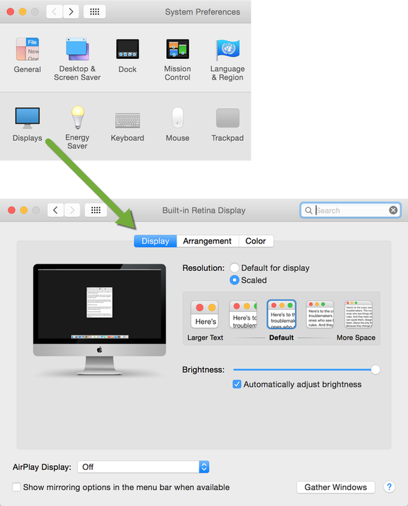
Mac screen resolution – options may look different on older machines
Steps for Windows users
* If your Control Panel layout isn’t similar to that shown in the image below, click Display and then Adjust resolution instead. 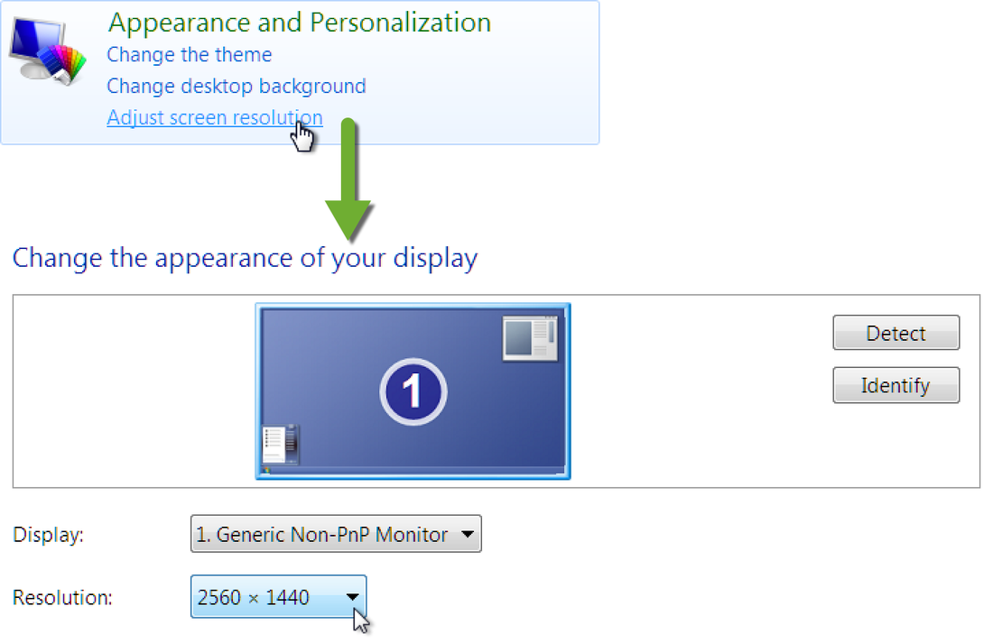
Windows screen resolution
Your screen will work best at its ‘native’ (default/recommended) resolution, but the performance may be perfectly adequate at different resolutions.
Tip 3: Be wary of straining your eyes
Visit your ophthalmologist or optometrist and make sure you’re using the right eyewear, if any.
The above tips should help us get the best from a single-screen setup. Let’s move on and see how we can boost productivity by adding a second screen. Adding a second screen
The best advert I can give you for the benefits of having a second screen is summed up by the extended screenshot below, taken from my own desktop.
This image shows four quite wide pages side by side with space to spare. This makes for an excellent user experience and has been the perfect way for me to get things done more quickly than ever before. 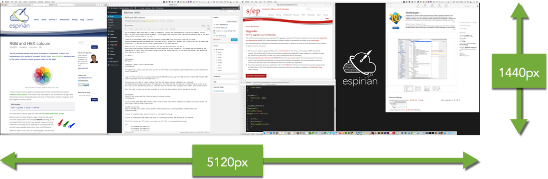
A view of my two screens – view full-resolution image (4.8MB)
Aligning and positioning screens
It’s important that your eyes are at the same level as the top of your screen(s). There’s a lot more information about how best to sit at your desk on Apple’s Eyes and Vision page. When using two screens, try your best to keep both at very similar levels, so that your view adjusts easily between them. A pair of good quality stands with adjustable height settings will allow you to equalise the heights of the screens. This adds to the cost but is best for your long-term health – plus you should gain a little storage space underneath the stands. Screen recommendations Here are my general recommendations if you’re looking to buy a second screen:
Making the connection Your screen will work best at its ‘native’ (default/recommended) resolution, but the performance may be perfectly adequate at different resolutions. Here are the commonest options:
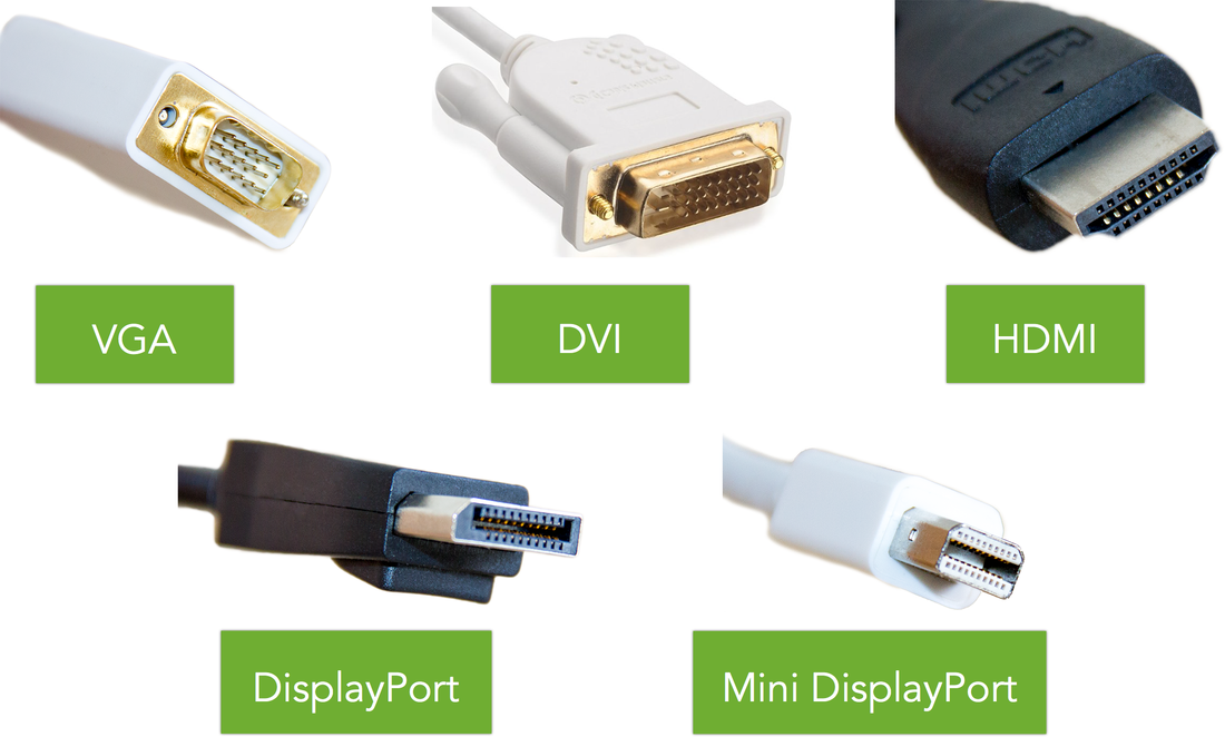
For completeness, I ought to mention that Apple’s new MacBook laptops now use a USB-C port. This means yet another type of adapter and cable is required to connect these new machines to a second screen (and at around £60, Apple’s official adapter isn’t cheap). The latest MacBook Pro and MacBook Air laptops still support Mini DisplayPort/Thunderbolt.
My own choice
Conclusion
Having looked at several options, I decided to go for a DisplayPort-compatible screen with a 3840 × 2160 maximum resolution. In practice, running the screen at 2560 × 1440 has been more than adequate.
What do you think? Have you added a second screen and wished you’d done it a long time ago? Post a comment below or catch up with me on Twitter.
John Espirian is the relentlessly helpful technical copywriter and author of Content DNA.
John writes B2B web content to help his clients explain how their products and services work. He also helps people to build a better presence on LinkedIn. Find John at espirian.co.uk or on LinkedIn.
4 Comments
In this article I share my experiences with StyleWriter4 Professional, a piece of software I purchased in 2015. I use this as a proofreading tool, though that’s not solely what the developers designed it for.
It complements the work I do with my eyes, increasing (1) the efficiency with which I work and (2) the quality of my output. Efficiency increases keep me happy because I can do certain tasks more quickly, thus improving my hourly rate; improvements in output quality keep my clients happy because they want as high a “hit” rate as possible. What is StyleWriter4? Essentially, StyleWriter4 is software that aims to help users with proofreading, editing, and plain-English writing. It comes in three versions:
A caveat on this proofreader’s usage I bought StyleWriter4 with a proofreader's hat on, not an editor's, because at the time I wanted quick and easy access to the information in the Editor’s List – that, and nothing more. It’s important that I emphasize this straight away. With my editor's hat on I could use the tools that attend to passive voice, sentence length, overwriting, or overall style. Since I haven't used these tools, however, I can’t comment on the degree to which the software is effective in its claims to address these issues effectively. So, what’s so great about the Editor’s List? Why I use the Editor’s List Sometimes we see what we want to see rather than what’s actually on the page. Being an experienced and professionally trained proofreader doesn’t make me immune to this problem. Rather, my experience and my professional training have made me alert to it. That’s why I always generate a word list to flag up potential inconsistencies that my weary eyes might have passed over. Such a list allows me to make sure I check spelling errors (e.g., poofreader), consistency issues (e.g., Francois and François), context-dependent errors (e.g., behaviour and behavior). Not every issue will need to be attended to, but it will need to be checked. This is where the Editor’s List comes to the fore. Running StyleWriter4 Professional on a Word document quickly and cleanly generates lists of words that I can use to spot potential problems I want to check, prior to reading the text line by line with my eyes. Generating word lists is all about spotting possible serious snags (e.g., inconsistent spelling of character or cited-author names) before the in-context proofreading starts. Looking through such lists gives me piece of mind and allows me, later, to focus my attention on context and layout. Step-by-step summary The following is a step-by-step summary of how I generate the information I need from the Editor’s List: 1. Create a Word document. If I’ve been contracted to work directly in Word by my client, I’m good to go. If I have a PDF, I copy the text from the PDF proof and paste it into a Word file. (I choose not to use Acrobat’s built-in conversion tool because I’ve found it leads to problems with text flow, and I have to devote even more time to fixing these before I run any Word-based tools, such as macros. However, this is a personal choice.) I remove unnecessary word breaks from the document by using Word’s Find and Replace tool (find “-^p” then “- ^p” then “ -^p”); always leave the replace box blank. You may have a macro that does this for you more efficiently. 2. Go to the Add-Ins tab and click on the StyleWriter icon. 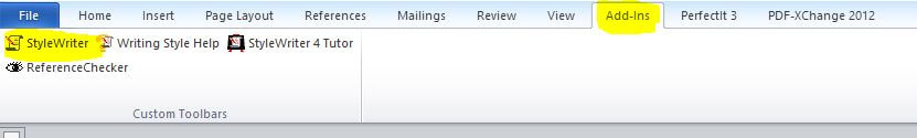
3. Click on the arrow next to the Editor’s List icon: that’s the little picture of the chap wearing Men-in-Black shades!

4. Select the list you want to look at. The lists I usually focus on are “All” (which includes the following separate lists of interest to me: “All words” and “Odds and ends”); and “Spelling” (which includes the following separate lists of interest to me: “Unknown words,” “Questionable words,” and “Unusual words”).
In the image below, I’ve highlighted the tabs of interest as they appear in the Editor’s List window, and the option at the bottom of the window to order the chosen word lists alphabetically or by frequency. 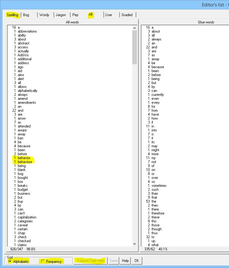
I then scroll through the lists at my leisure, checking any problems I detect. In the image above, I’ve highlighted an inconsistent spelling issue that I’d need to check (behaviour/behaviour) in order to identify whether there is an error in the text.
If I were working for a client directly in Word, I could use the “Trace in Text View” button highlighted at the bottom of the window. If I was working on hardcopy or PDF, I’d search for the problem in the PDF and then mark up on paper or on screen, as per the client’s wishes. Why not use TextSTAT? I also use TextSTAT for the creation of word lists for my proofreading and editing work. I loved this software. I still love it! See How do I find spelling inconsistencies when proofreading and editing? for more information about how I use this tool in an almost identical way. And TextSTAT is free, whereas StyleWriter4 Professional costs US$123 (in 2015). So, before buying, I decided to do a cost/benefit analysis. If I was going to invest in this software, I needed to know how quickly I would get a return. I compared how long it took me to work through all the little bits and necessary to generate full-word and spelling lists using TextSTAT and StyleWriter4 Professional. With StyleWriter, the process is a one-stop shop. I open and run the software in the Word file. I then click on Editor’s List and choose what I want to look at. With TextSTAT, things are more fiddly. I have to upload the Word document, create full-word list, export the list into Excel, copy the Excel version into Word, alphabetize and check. Then I run a separate macro to generate possible list of potential spelling errors. Using StyleWriter4 Professional saved me only five minutes for a 150,000-word file. However, when it comes to productivity in editorial work, marginal gains always count.
Considerations before you buy Use the trial version before you buy. The website currently doesn’t indicate which version is available for download. It’s therefore worth emailing the developers to check which edition you’ll be experimenting with. If you’re a proofreader like me, and are considering the software primarily to access the Editor’s List, you’ll need to trial the Professional version. View the video demos on the StyleWriter4 website, so you can see how the various features work. Cost – it’s not free. If you are using alternative free software (such as TextSTAT) to generate checkable full-word and spelling lists, do your own cost-to-benefit analysis so that you can work out whether and when you will earn a return on your investment. You’ll need to know the value you place on X minutes of your time in order to do this. You might recoup your investment in a shorter or longer period of time than me because there are differences in our hourly rates, our fee structures, the services we offer, the speed at which we use alternative software, how many separate jobs we do per month, the word count in the files, and so on. This article was first published on An American Editor.
Louise Harnby is a line editor, copyeditor and proofreader who specializes in working with crime, mystery, suspense and thriller writers.
She is an Advanced Professional Member of the Chartered Institute of Editing and Proofreading (CIEP), a member of ACES, a Partner Member of The Alliance of Independent Authors (ALLi), and co-hosts The Editing Podcast. Visit her business website at Louise Harnby | Fiction Editor & Proofreader, say hello on Twitter at @LouiseHarnby, connect via Facebook and LinkedIn, and check out her books and courses.
An in-house editor discusses how he handles receipt of substandard work from a freelancer. Also worth noting is his advice on how a freelancer might interpret a lack of contact from an in-house editor and what to do about it ...
Philip Stirups sheds light on his experiences of editorial production. To be clear, Philip’s contributions are from the point of view of a publishing professional, broadly speaking. So while some of the things he has to say are informed by his experiences within the UK company for which he currently works, his residency here is not in the capacity of a representative of that particular publishing house. Over to Philip ...
At the outset, I want to say that the majority of proofreading jobs I receive back from freelancers are good. However, in a handful of instances, a job comes back and, unfortunately, it isn't up to scratch. Problems could include:
From an editorial perspective, this can cause an array of different problems. First, an unsatisfactory proofread will usually lead to the in-house editor having to step in to compensate, which can in turn have an adverse impact on the book schedule. A second problem, from an in-house editorial perspective, is even trickier: how to give feedback in an honest, yet tactful, way. Breaking the bad news … On the surface, the simple solution to this seems to be: "tell it as it is". However, this is easier in theory than in practice. The problem is that it’s quite difficult to convey tone via email. I want to get across what has been missed, but in such a way as not to seem condescending. Furthermore, I don't want the freelancer to go away thinking they've done a bad job, when overall they haven’t. I could use the phone in order to avoid tone problems. However, I believe that an email is more beneficial to the freelancer because it provides them with a written record of the issues; this means they have something to refer back to when they carry out future work for the in-house editor. Receiving criticism, albeit constructive feedback, can be a shock for the freelancer, and very upsetting. I don’t want my suppliers to lose confidence when I have to tell them a job didn’t meet my requirements. Instead, I want to communicate the message in a way that enables them to move forward, strong in the knowledge that by attending to the highlighted problems our working relationship can continue satisfactorily. Email gives them the time and space to digest the feedback I've offered in a non-confrontational way. In cases where the work continues to be substantially below expectations, the clearest feedback a freelancer will receive may be represented by them not being offered further work. This isn't to say that, overall, they are not good at what they do – rather, each job needs to be assessed on an individual basis, and when a freelancer is unable to use critical feedback to meet the in-house editor’s needs, the editor may decide that the supplier is no longer a good fit. Things aren’t always what they seem … Being offered no work, or only intermittent work, is not always an indication of poor fit or poor-quality work. It can often simply be, as I have often experienced, a case of there being no work available at the time. Publishers' production workflows vary. A large house, with multiple imprints, that publishes mass-market paperback fiction may have a steady stream of projects to offer freelancers throughout the year, while a smaller independent academic press specializing in social science monographs or student handbooks may have busy and quiet spells in its production process. It may also be that the freelancer had regularly turned down work, owing to the demands of their schedule. In this case, the in-house editor may have taken the decision to focus on other suppliers who are more often available. It’s not a question of poor fit or poor quality; rather, the freelancer has simply slipped out of the in-house editor's mind. If you’ve not been offered work from one of your in-house editors for a longer time than you feel comfortable with, get in touch. It never hurts to drop an editor a message to ask whether they have any projects. The worst they can say is “no”, and even if they don't have anything to offer you now, but are happy to work with you again, you’re back on their radar. Don’t be afraid to ask … I cannot say there is a right or wrong way to give feedback. However, I firmly believe that openness on both sides is the key. I am willing to admit that my freelancer briefs could be improved. If you ever want feedback from your editor, just ask ... And remember: it is never personal; it’s about meeting a set of business requirements. We in-house editors and freelancers are on the same team.
Louise Harnby is a line editor, copyeditor and proofreader who specializes in working with crime, mystery, suspense and thriller writers.
She is an Advanced Professional Member of the Chartered Institute of Editing and Proofreading (CIEP), a member of ACES, a Partner Member of The Alliance of Independent Authors (ALLi), and co-hosts The Editing Podcast. Visit her business website at Louise Harnby | Fiction Editor & Proofreader, say hello on Twitter at @LouiseHarnby, connect via Facebook and LinkedIn, and check out her books and courses.
In this post I show you how to reorganize the display of your digital proofreading stamps in PDF-XChange so you can improve the efficiency with which you work.

The free digital stamps files I’ve provided here on The Editing Blog contain over 70 individual images, all based on the British Standards Institution’s “Marks for copy preparation and proof correction” (BS 5261C:2005).
The issue for many newbies is that the palette can appear cumbersome – we all work in different ways, and the symbols that we most often use may not be positioned in the most convenient place for our particular needs. Having the full palette open on the screen takes up a lot of space, even if, like me, you use multiple screens. I prefer to have my palette near the text because it’s quicker to access, thus increasing my efficiency: 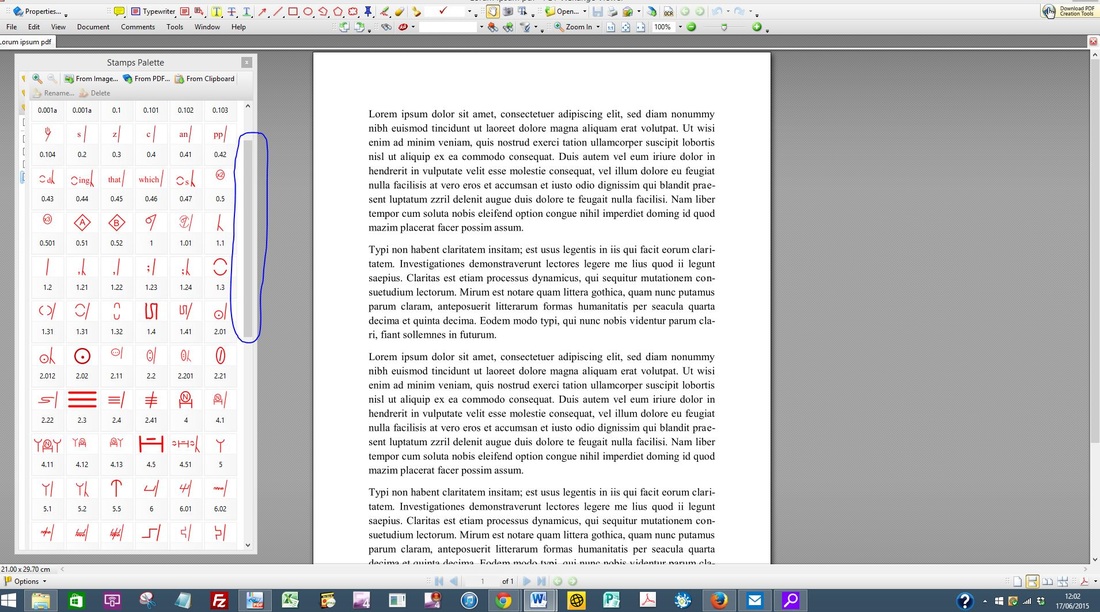
Decreasing the size of the palette is one option, and allows placement on the screen that won’t interfere with the text. However, this requires using the scroll bar on the palette in order to access the stamps located further down the palette, reducing efficiency further because not all the stamps are on display.
Reorganizing the stamps for your own needs
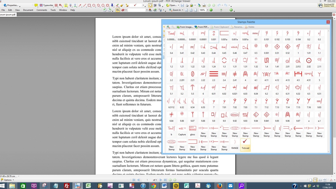
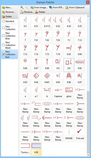
When I created the original stamps files, I ordered them according to what my specific needs were at that time. But my preferences have changed since 2012, and it’s not unusual for my current preferences to change on a job-by-job or client-by-client basis. For example, one particular client for whom I work provides me with PDFs that frequently require the use of the Turn over character(s)/word(s)/line(s) symbol. This symbol is located near the end of the downloadable stamps files. This meant that when I first opened up the palette in XChange it appeared as follows (see highlighted area at the bottom of the image below): 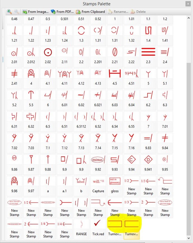
The solution is to move the frequently used symbol to the top of the palette for this particular client work. This is most simply done by renaming the stamp in a way that forces it into the required position. My preference is to name most of my stamps with numbers rather than descriptive names (see image above and compare the often-used Delete symbol (named 1) with the rarely used Change to small caps mark (named 9.83).
The beauty of renaming with numbers is that you have the freedom to move any stamp anywhere at any time. You can change the positions as and when you wish. For demonstration purposes, I’ve chosen to move the right-hand margin Turn over symbol to the top of the palette and place it next to the Delete symbol. The process is quick and simple: 1) Left-click on the symbol you want to move. The area below the mark, where the symbol's name is located, will appear with an orange tint. 
2) Move your mouse to the top of the palette and left-click on the “Rename” tab. A window will appear, housing the stamp’s current name.
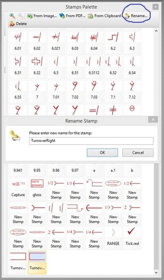
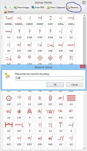
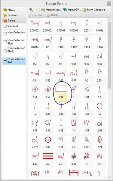
3) Type in a new numbered name that will force the stamp into the numerically ordered position you desire. In this case, I want the Turn over symbol to appear next to the Delete symbol. Delete is named “1”; the stamp to the left is named “0.52”. Choosing any number between 0.52 and 1 for Turn over will therefore ensure preferred placement. I decide to rename Turn over as “0.99”. I type in the number and select “OK”.
4) Note that the stamp has been renamed but it still hasn’t moved into its new position.
In order to force the repositioning, I need to move out of the currently displayed palette and then reopen it. This can be done in two ways. Either close the palette completely by clicking on the X in the top-right-hand corner of the window (then reopen via the menu: Tools>Comment And Markup Tools>Show Stamps Palette) …
… or switch to a different Collection and then move back into the original Collection in which you renamed your stamp. The Collections can be found on the left-hand sidebar of the XChange palette, and you can move this sidebar in and out of view by clicking on and dragging the thick grey line, as highlighted below.
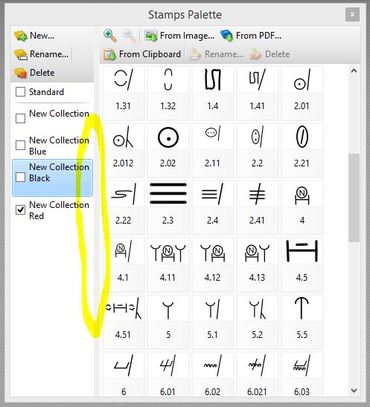
5) When you reopen the palette and click on the appropriate Collection, you’ll see your renamed stamp positioned exactly where you want it. To move the Collections sidebar out of view, simply click and drag on the grey line. This will provide more space in which to display all your proofreading symbols.
Marginal gains for increased efficiency
If renaming stamps seems like a lot of effort for little reward, remember that marginal gains count for a lot with editorial work. This is why tools such as macros, shortcuts and find/replace are useful. The same applies to creating an efficient stamps palette. Every second you spend scrolling to find the stamp you want adds up. Seconds become minutes, and minutes become hours. If you’re being paid per hour, and your client doesn’t have a top-line budget, it may not matter how long it takes you to do a job, nor that you’re working inefficiently. However, many clients do have a top line, and many editorial professionals are working for fixed fees. Efficiency matters. Furthermore, some of us need to attend to the way in which we use our hands, wrists and arms repetitively when working onscreen. Organizing a stamps palette in a way that is memorable to you, and enables the fastest possible access, speeds up the onscreen markup process and reduces physical strain. If you haven’t got round to renaming your stamps numerically, try it and see whether it makes a difference.
Louise Harnby is a line editor, copyeditor and proofreader who specializes in working with crime, mystery, suspense and thriller writers.
She is an Advanced Professional Member of the Chartered Institute of Editing and Proofreading (CIEP), a member of ACES, a Partner Member of The Alliance of Independent Authors (ALLi), and co-hosts The Editing Podcast. Visit her business website at Louise Harnby | Fiction Editor & Proofreader, say hello on Twitter at @LouiseHarnby, connect via Facebook and LinkedIn, and check out her books and courses. |
PDF MARKUP
AUTHOR RESOURCES
EDITOR RESOURCES
TESTIMONIALSDare Rogers'Louise uses her expertise to hone a story until it's razor sharp, while still allowing the author’s voice to remain dominant.'Jeff Carson'I wholeheartedly recommend her services ... Just don’t hire her when I need her.'J B Turner'Sincere thanks for a beautiful and elegant piece of work. First class.'Ayshe Gemedzhy'What makes her stand out and shine is her ability to immerse herself in your story.'Salt Publishing'A million thanks – your mark-up is perfect, as always.'CATEGORIES
All
ARCHIVES
July 2024
|


 RSS Feed
|
|
|
|

|

|
|
|
|

© 2011–2024 Louise Harnby