|
In this post I show you how to reorganize the display of your digital proofreading stamps in PDF-XChange so you can improve the efficiency with which you work.
The free digital stamps files I’ve provided here on The Editing Blog contain over 70 individual images, all based on the British Standards Institution’s “Marks for copy preparation and proof correction” (BS 5261C:2005).
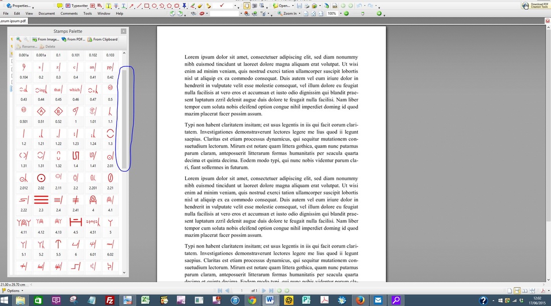
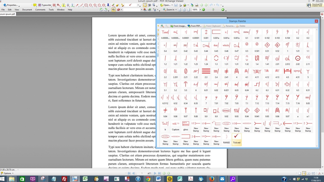
The issue for many newbies is that the palette can appear cumbersome – we all work in different ways, and the symbols that we most often use may not be positioned in the most convenient place for our particular needs. Having the full palette open on the screen takes up a lot of space, even if, like me, you use multiple screens. I prefer to have my palette near the text because it’s quicker to access, thus increasing my efficiency:
Decreasing the size of the palette is one option, and allows placement on the screen that won’t interfere with the text. However, this requires using the scroll bar on the palette in order to access the stamps located further down the palette, reducing efficiency further because not all the stamps are on display.
Reorganizing the stamps for your own needs
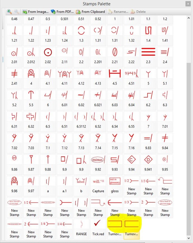
When I created the original stamps files, I ordered them according to what my specific needs were at that time. But my preferences have changed since 2012, and it’s not unusual for my current preferences to change on a job-by-job or client-by-client basis. For example, one particular client for whom I work provides me with PDFs that frequently require the use of the Turn over character(s)/word(s)/line(s) symbol. This symbol is located near the end of the downloadable stamps files. This meant that when I first opened up the palette in XChange it appeared as follows (see highlighted area at the bottom of the image below):
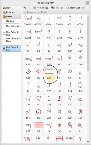
The solution is to move the frequently used symbol to the top of the palette for this particular client work. This is most simply done by renaming the stamp in a way that forces it into the required position. My preference is to name most of my stamps with numbers rather than descriptive names (see image above and compare the often-used Delete symbol (named 1) with the rarely used Change to small caps mark (named 9.83).
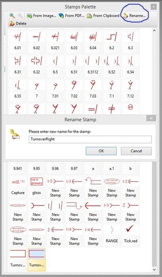
The beauty of renaming with numbers is that you have the freedom to move any stamp anywhere at any time. You can change the positions as and when you wish. For demonstration purposes, I’ve chosen to move the right-hand margin Turn over symbol to the top of the palette and place it next to the Delete symbol. The process is quick and simple: 1) Left-click on the symbol you want to move. The area below the mark, where the symbol's name is located, will appear with an orange tint.
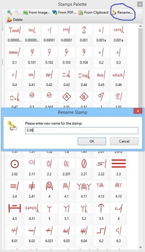
2) Move your mouse to the top of the palette and left-click on the “Rename” tab. A window will appear, housing the stamp’s current name.
3) Type in a new numbered name that will force the stamp into the numerically ordered position you desire. In this case, I want the Turn over symbol to appear next to the Delete symbol. Delete is named “1”; the stamp to the left is named “0.52”. Choosing any number between 0.52 and 1 for Turn over will therefore ensure preferred placement. I decide to rename Turn over as “0.99”. I type in the number and select “OK”.
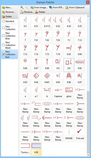
4) Note that the stamp has been renamed but it still hasn’t moved into its new position.
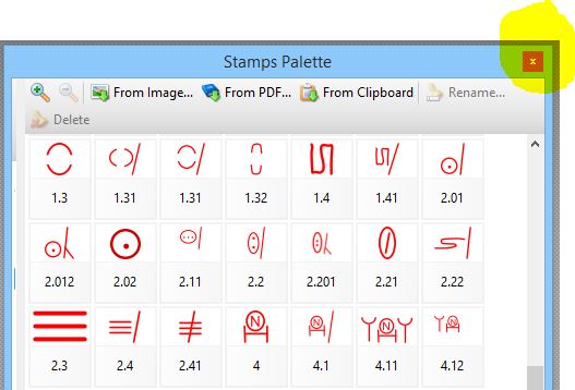
In order to force the repositioning, I need to move out of the currently displayed palette and then reopen it. This can be done in two ways. Either close the palette completely by clicking on the X in the top-right-hand corner of the window (then reopen via the menu: Tools>Comment And Markup Tools>Show Stamps Palette) …
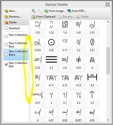
… or switch to a different Collection and then move back into the original Collection in which you renamed your stamp. The Collections can be found on the left-hand sidebar of the XChange palette, and you can move this sidebar in and out of view by clicking on and dragging the thick grey line, as highlighted below.
5) When you reopen the palette and click on the appropriate Collection, you’ll see your renamed stamp positioned exactly where you want it. To move the Collections sidebar out of view, simply click and drag on the grey line. This will provide more space in which to display all your proofreading symbols.
Marginal gains for increased efficiency
If renaming stamps seems like a lot of effort for little reward, remember that marginal gains count for a lot with editorial work. This is why tools such as macros, shortcuts and find/replace are useful. The same applies to creating an efficient stamps palette. Every second you spend scrolling to find the stamp you want adds up. Seconds become minutes, and minutes become hours. If you’re being paid per hour, and your client doesn’t have a top-line budget, it may not matter how long it takes you to do a job, nor that you’re working inefficiently. However, many clients do have a top line, and many editorial professionals are working for fixed fees. Efficiency matters. Furthermore, some of us need to attend to the way in which we use our hands, wrists and arms repetitively when working onscreen. Organizing a stamps palette in a way that is memorable to you, and enables the fastest possible access, speeds up the onscreen markup process and reduces physical strain. If you haven’t got round to renaming your stamps numerically, try it and see whether it makes a difference.
Louise Harnby is a line editor, copyeditor and proofreader who specializes in working with crime, mystery, suspense and thriller writers.
She is an Advanced Professional Member of the Chartered Institute of Editing and Proofreading (CIEP), a member of ACES, a Partner Member of The Alliance of Independent Authors (ALLi), and co-hosts The Editing Podcast. Visit her business website at Louise Harnby | Fiction Editor & Proofreader, say hello on Twitter at @LouiseHarnby, connect via Facebook and LinkedIn, and check out her books and courses.
1 Comment
17/6/2015 09:17:36 am
Louise,
Reply
Leave a Reply. |
BLOG ALERTSIf you'd like me to email you when a new blog post is available, sign up for blog alerts!
TESTIMONIALSDare Rogers'Louise uses her expertise to hone a story until it's razor sharp, while still allowing the author’s voice to remain dominant.'Jeff Carson'I wholeheartedly recommend her services ... Just don’t hire her when I need her.'J B Turner'Sincere thanks for a beautiful and elegant piece of work. First class.'Ayshe Gemedzhy'What makes her stand out and shine is her ability to immerse herself in your story.'Salt Publishing'A million thanks – your mark-up is perfect, as always.'CATEGORIES
All
ARCHIVES
July 2024
|
|
|
|









 RSS Feed


