

|
‘A good design should be almost invisible. It should support your words, deliver them to the reader, not get in the way.’
Rebecca Brown, Design for Writers 
I'm delighted to welcome Rebecca Brown of Design for Writers to the Proofreader's Parlour. Design for Writers is the team I refer my authors to when they ask for help with book formatting and design.
In this post, Rebecca offers her expert advice on how to get the best from your book interior ...
Congratulations! Having shed blood, sweat and tears, and arrived at a finished manuscript, you’ve decided to take the plunge and self-publish.
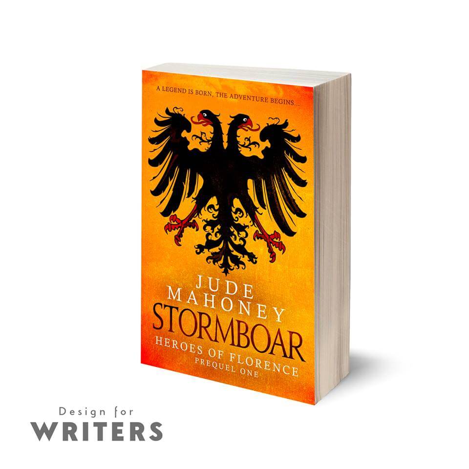
As part of the process of finding the best people to help you do that, one of your priorities will be making your book look as professional as possible. Everyone’s heard the saying ‘Don’t judge a book by its cover’. Yet most people do just that. And they judge it by how it looks inside, too. The cover will get people to pick your book off the shelf; the interior will help make it a pleasure to read. Why is interior design important? Your words have been carefully edited and chosen to hook your readers, but the best opening lines may never even be read if they’re set in a font that’s difficult to read, the margins are so small that you need to crack the spine just to read the start of each line, or the overall design looks rushed and unprofessional. Many self-published authors rely on online sales of both print books and ebooks though, so, okay, a badly designed book might not necessarily put off all prospective buyers. But do you want your readers to leave reviews saying, ‘I don’t know if this book was any good because it was horrible to read’? It does happen, just as readers will leave reviews that criticize poor editing or a weak story line. And those readers are less likely to return for Book Two. What does a well-designed book look like? The best way of answering that is to look at some professionally published books. This is what you’ll find. Text: The text is large enough to read – usually around 11 or 12 point – but not too large (unless it’s a large-print edition) of course; the point is that the text size is appropriate for the target audience. Margins: There’s plenty of space around the text. You don’t want tiny margins; you need to be able to see the text as it goes in towards the spine, and you need to be able to hold it around the edges without your thumb obscuring the words. Some titles will have bigger margins, like children’s books. Again, it’s about an appropriate design for your readership. Typeface: The most obvious and striking feature is the chosen typeface. It should be a serif font (like Garamond, or Times) not a sans-serif font (like Arial) for the body text. Serif fonts are easier on the eyes for long format, physical text. Sans-serif fonts are easier for on-screen reading on a computer. However, this itself can depend on the type of book – many people prefer a sans-serif for some kinds of non-fiction. For fiction, though, choose a traditional serif font. That way, if you need to make part of the text stand out – for example, if your protagonists exchange text messages, it’ll be more obvious that you’ve made a deliberate style choice, and have a more professional impact. When it comes to print books, small details like embellishments and display fonts for titles all add to the pleasure of reading, and to the sense of your book as a beautiful piece of work. That doesn’t mean you should try to mimic the same experience in your ebook, though …
Print and digital books are different animals Authors often hugely underestimate just how different ebooks and print are. Don’t aim for a duplicate of your print book – it’s a different reading experience. A stand-out feature of ebooks is the extent to which the reader can set up the reading experience to fit their personal preferences (for example, text size, font, and spacing). If you try to force a replica of your print book, you’re doing your book a disservice and making things more difficult for your reader. For example, every ebook device is slightly different, so if you have many different embellishments and beautiful fonts, you’re increasing the risk of the book not displaying as you intended, perhaps not working properly at all. Doing it yourself Authors can, and often do, carry out the work themselves. There are many good guides to setting out your text, and if you bear certain guidelines in mind, such as those mentioned above, you’ll be able to produce a decent book. If your budget is limited, this can be a good option. Bear in mind the following:
Ebook
Hiring a professional
While you can do it yourself, there is a risk that you'll miss out those extra design elements that make your book stand out. Hiring pro interior designers ensures that your files are absolutely guaranteed to work with the major retailers, and that your book will offer your readers the best reading experience possible, regardless of format (e.g. paperback, hardback, ereader). So what should you look for? Price is always a consideration of course. This can be an expensive endeavour, but sometimes you do get what you pay for, and cheaper is not necessarily better. Look for what’s included in the package:
For print, at least, the designer’s use of InDesign demonstrates a level of skill and commitment to using professional tools. Ask to see examples of your prospective formatter work. Find out what books they’ve worked on (from their website or social media, for example) and take a look at the ‘Look Inside’ feature on Amazon, noting the following:
Evaluating the professional designer’s process It’s important to understand how your designer works if you’re to get the best value for your investment. If they’re not interested in getting to know your book and your style, that should be a red flag. Ask them how they would like your manuscript to be sent to them. Most will want final, fully edited text in a common format (such as a Microsoft Word document), but often they’ll allow a ‘reasonable’ number of small changes after proof stage. That’s because designers are human, too! We realize that seeing your work laid out for the first time can alert you to small typos and errors, no matter how carefully you’ve checked it. However, multiple rounds of editing once the text is laid out can have a bigger impact than you might think, so get it as close to finished as you possibly can, and make sure you understand what levels of revision are included by your formatter. Finally, and this goes for any book-publication service, think about your initial contact with them. What are they like to work with? There’ll be quite a lot of back-and-forth. Discussion is important because this is such a personal, important project for you. Having a great rapport with your designer is essential. Good luck! Rebecca’s top tip
Whether you’re doing it yourself or paying someone, keep it simple! Your text is what the reader’s bought, so a good design should be almost invisible. It should support your words, deliver them to the reader, not get in the way.
Design for Writers
For drama-free book design, contact Rebecca or Andrew at [email protected] or www.designforwriters.com
Louise Harnby is a line editor, copyeditor and proofreader who specializes in working with crime, mystery, suspense and thriller writers.
She is an Advanced Professional Member of the Chartered Institute of Editing and Proofreading (CIEP), a member of ACES, a Partner Member of The Alliance of Independent Authors (ALLi), and co-hosts The Editing Podcast. Visit her business website at Louise Harnby | Fiction Editor & Proofreader, say hello on Twitter at @LouiseHarnby, connect via Facebook and LinkedIn, and check out her books and courses.
5 Comments
Carlos-François Lens
18/9/2018 05:28:36 pm
Title: EVIL HUNTERS UNDER GOD
Louise Harnby
18/9/2018 05:39:34 pm
Hi, Carlos.
Traci Freed
29/11/2018 05:11:32 pm
Great article! Love the quote ‘a good design should be almost invisible.’ It’s true your interior book design is something people never notice unless it’s done wrong. To build on the information in this article, authors may want to check out this article I recently came across. It went into a lot of detail about how to design both print books and eBooks and options for creating your print layout. It’s worth a read. Check it out here: https://scribewriting.com/interior-book-layout/
Richard J Strutz
27/1/2020 09:16:55 pm
Am close to final edit and am in need of formatting --how is this priced ? Paperback and e-book--Thanks
Louise Harnby
28/1/2020 09:13:13 am
You'd need to contact Design for Writers direct, Richard. Leave a Reply. |
PDF MARKUP
AUTHOR RESOURCES
EDITOR RESOURCES
TESTIMONIALSDare Rogers'Louise uses her expertise to hone a story until it's razor sharp, while still allowing the author’s voice to remain dominant.'Jeff Carson'I wholeheartedly recommend her services ... Just don’t hire her when I need her.'J B Turner'Sincere thanks for a beautiful and elegant piece of work. First class.'Ayshe Gemedzhy'What makes her stand out and shine is her ability to immerse herself in your story.'Salt Publishing'A million thanks – your mark-up is perfect, as always.'CATEGORIES
All
ARCHIVES
July 2024
|

 RSS Feed
|
|
|
|

|

|
|
|
|

© 2011–2024 Louise Harnby