

|
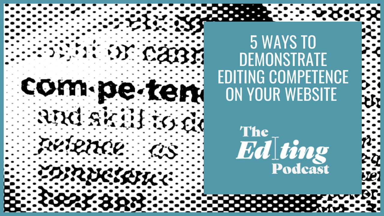
Learn 5 tips on how to show rather than tell potential clients about your editing skills and knowledge.
|


|
Editor Website Essentials: Find out how to craft a visible, loveable editorial website with this 10-step framework that takes you through the essentials of SEO, navigation, structure, visitors, UX, branding, web page copy, home page design, content and analytics. Find out more about the course.
|

|
|
Blogging for Business Growth: Learn how to create a discoverable, captivating and memorable blog that drives website traffic, increases visibility in the search engines, and generates editing work. Find out more about the course.
|
|
Louise Harnby is a line editor, copyeditor and proofreader who specializes in working with crime, mystery, suspense and thriller writers.
She is an Advanced Professional Member of the Chartered Institute of Editing and Proofreading (CIEP), a member of ACES, a Partner Member of The Alliance of Independent Authors (ALLi), and co-hosts The Editing Podcast.
She is an Advanced Professional Member of the Chartered Institute of Editing and Proofreading (CIEP), a member of ACES, a Partner Member of The Alliance of Independent Authors (ALLi), and co-hosts The Editing Podcast.
- Get in touch: Louise Harnby | Fiction Editor & Proofreader
- Connect: Twitter at @LouiseHarnby, Facebook and LinkedIn
- Learn: Books and courses
- Discover: Resources for authors and editors
Find out why you need a website if you want your editing or proofreading business to be visible and verifiable.

Summary of Episode 85
In this episode, Louise and Denise chat about:
- Why you need a website even if you work only with publishers and packagers
- Why editorial directories aren't enough
- Why word of mouth has limitations
- How clients use websites for quality control
- Why a website future-proofs your business
- Current audience expectations around professionalism
- Websites versus social media presence
- Controlling your own land
- Creating a branded digital space
- Competing with colleagues who have websites
Join our Patreon community
If you'd like to support The Editing Podcast, thank you! That means the world to us. There are two tiers to choose from:
- EditPod Tea Pot: Buy us a cuppa and help keep the podcast ad-free and independent.
- EditPod Tea Party: All of the above, plus you get exclusive access to quarterly live Q&As that help you keep your business on track.
Music credit
‘Vivacity’ Kevin MacLeod (incompetech.com). Licensed under Creative Commons: By Attribution 3.0 License. http://creativecommons.org/licenses/by/3.0/
Craft a website that gets you work!
|
Want to learn how to craft a standout editorial website that makes you visible in the search engines and compels your ideal clients to hire you?
Check out Editor Website Essentials, my flagship online training course created just for editors and proofreaders. |
Louise Harnby is a line editor, copyeditor and proofreader who specializes in working with crime, mystery, suspense and thriller writers.
She is an Advanced Professional Member of the Chartered Institute of Editing and Proofreading (CIEP), a member of ACES, a Partner Member of The Alliance of Independent Authors (ALLi), and co-hosts The Editing Podcast.
She is an Advanced Professional Member of the Chartered Institute of Editing and Proofreading (CIEP), a member of ACES, a Partner Member of The Alliance of Independent Authors (ALLi), and co-hosts The Editing Podcast.
- Get in touch: Louise Harnby | Fiction Editor & Proofreader
- Connect: Twitter at @LouiseHarnby, Facebook and LinkedIn
- Learn: Books and courses
- Discover: Resources for authors and editors
Discover 3 actions you can take to improve the design of your editorial website and that can be implemented within only 24 hours.


Summary of Episode 83
Denise and I chat about how editors and proofreaders can improve the user experience on their websites with 3 easy-to-implement actions. Listen to find out more about:
- Navigation buttons
- Paragraph headings
- Short paragraphs
Join our Patreon community
If you'd like to support The Editing Podcast, thank you! That means the world to us. There are two tiers to choose from:
- EditPod Tea Pot: Buy us a cuppa and help keep the podcast ad-free and independent.
- EditPod Tea Party: All of the above, plus you get exclusive access to quarterly live Q&As that help you keep your business on track.
Music credit
‘Vivacity’ Kevin MacLeod (incompetech.com). Licensed under Creative Commons: By Attribution 3.0 License. http://creativecommons.org/licenses/by/3.0/
Craft a website that gets you work!
|
Want to craft a standout editorial website that makes you visible in the search engines and compels your ideal clients to hire you? Check out Editor Website Essentials, my flagship online training course created just for editors and proofreaders.
|
|
Louise Harnby is a line editor, copyeditor and proofreader who specializes in working with crime, mystery, suspense and thriller writers.
She is an Advanced Professional Member of the Chartered Institute of Editing and Proofreading (CIEP), a member of ACES, a Partner Member of The Alliance of Independent Authors (ALLi), and co-hosts The Editing Podcast.
She is an Advanced Professional Member of the Chartered Institute of Editing and Proofreading (CIEP), a member of ACES, a Partner Member of The Alliance of Independent Authors (ALLi), and co-hosts The Editing Podcast.
- Get in touch: Louise Harnby | Fiction Editor & Proofreader
- Connect: Twitter at @LouiseHarnby, Facebook and LinkedIn
- Learn: Books and courses
- Discover: Resources for authors and editors
Do you know your brand colours? They’re part of what makes you recognizable, so they’re worth paying attention to – and sticking to. Here’s one way to keep track of your choices and enforce consistency.
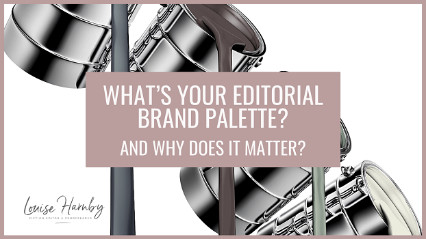

What is a brand palette?
A brand palette is the group of colours you use across your business materials, including the following:
|
|
If we’re communicating in online spaces that we don’t control, we’re limited to a certain extent by the platform’s own brand palette.
For example, we can upload on-brand images to our Facebook, Twitter and LinkedIn headers, but we can’t change the colour of the links or icons on our posts.
And members of the Chartered Institute of Editing and Proofreading who advertise in its Directory of Editorial Services can upload on-brand headshots, videos and images to their listings but must work within the CIEP’s unique brand palette.
Do the best you can in the spaces you don’t control. In those you do, go for consistency. Here’s why it’s important.
Why a consistent brand palette is powerful

Think about brands like Coke, Reese’s Pieces, Cadbury, McDonald’s, IKEA and Aldi. You can probably reel off the colours you associate with those companies, and that means you can identify them from afar or with just a glimpse.
Editorial brand palettes work the same way. They make us recognizable such that our colleagues, clients, friends and business partners can identify us in online spaces before they’ve dug into the detail of our messaging.
If we’ve already built trust with those people, they’re more likely to take the time to engage with our content because they know who it’s from.
Of course, they can also decide not to engage with us when our brand colours pop up in their social feeds or email inboxes because they’re not interested in us. Being recognizable means we don’t waste their time, and they don’t waste ours!
Deciding on your brand-palette rules
Once you’ve decided which colours are in your brand palette, consider your rules.
My brand palette comprises grey, white, grape, maroon and teal. My brand-palette rules include the following:
If you’re the kind of editor who can hold several hex colours in your head, all power to you. I’m not. I need to record them so I can access them quickly and remind myself of the ‘rules’ I’ve created.
That's why I built a brand book.
My brand palette comprises grey, white, grape, maroon and teal. My brand-palette rules include the following:
- Brand-colour gradients are allowed on some sections of my website
- Tints, shades and tones of my brand colours are allowed if UX will be improved
- Buttons on my website must always be solid teal
- Linked text must always be maroon with a teal hover
- Blog-post images take grape boxes on greyscale images
If you’re the kind of editor who can hold several hex colours in your head, all power to you. I’m not. I need to record them so I can access them quickly and remind myself of the ‘rules’ I’ve created.
That's why I built a brand book.
How to record your brand palette
A brand book isn’t the only way of recording your brand colours, but it’s useful if you want a single space in which to keep track of your brand colours, something you can access every time you create content related to your business. Mine's bookmarked so I can get to it quickly.
It's also a one-stop-shop you can send to creative consultants if you’re commissioning artwork or design services.
Don't stop at colours! Use it record all your editorial business's brand essentials. For example:
It's also a one-stop-shop you can send to creative consultants if you’re commissioning artwork or design services.
Don't stop at colours! Use it record all your editorial business's brand essentials. For example:
|
|
Here's what mine looks like. Use the thumbnails to move through the slideshow. If you’d like a free copy to mimic, head over to the branding page in my resource library and select the FREE BOOKLETS icon.
If it’s not something you think you can create for yourself, the Canva template is included free with the following courses:
If you’ve already bought one of them, log in to access the template, then copy it and edit it to create your own brand book quickly.
If you’ve already bought one of them, log in to access the template, then copy it and edit it to create your own brand book quickly.
Summing up
A brand palette ensures your editing business is consistently recognizable across multiple media. That means those who already know and trust you can spot you from afar or with a glimpse. And those just getting to know you understand what to expect.
Pick your colours and stick to them. Then keep a record of your choices. It means you can be sure you’ll be on brand everywhere!
Pick your colours and stick to them. Then keep a record of your choices. It means you can be sure you’ll be on brand everywhere!
Louise Harnby is a line editor, copyeditor and proofreader who specializes in working with crime, mystery, suspense and thriller writers.
She is an Advanced Professional Member of the Chartered Institute of Editing and Proofreading (CIEP), a member of ACES, a Partner Member of The Alliance of Independent Authors (ALLi), and co-hosts The Editing Podcast.
FIND OUT MORE
> Get in touch: Louise Harnby | Fiction Editor & Proofreader
> Connect: Twitter at @LouiseHarnby, Facebook and LinkedIn
> Learn: Books and courses
> Discover: Resources for authors and editors
Your editing website is your shop front. It’s the one online space you control – your land – and so it must work hard for you. Here are 3 things you can do quickly to make it function better.
In this post, I’ll show you 3 things you can do quickly to improve the way a visitor experiences every web page on your site. We’ll look at the following:
> Navigation buttons
> Paragraph headings
> Short paragraphs
> Navigation buttons
> Paragraph headings
> Short paragraphs

Navigation buttons
Being able to navigate a site is key to a good user experience. Buttons signal the delivery of a promise: learn this, go there, download that.
Imagine you’re in a huge, multi-storey department store. Buttons are like the floor plan near the escalator that tells you what’s where.
Make buttons consistent
Check that your buttons are a consistent colour. That way you’re training visitors to understand that there’s something at the end of the click.
A contrasting hover colour signals that the button is active, that it can be engaged with.
Help people find stuff!
Don’t assume your visitors know where to go, or that they’ll go where you want them to go.
Check every page on your website. Can you add buttons that will make your visitor’s journey easier and that tell them what you'd like them to do?
People are busy and might not have time to trawl through text. Buttons stand out, which means they’re scannable. Use them to help the visitor:
> Get to another page
> Get to another section on the same page
> Access a resource
> Get in touch with you
Include a meaningful call to action
A button that’s easy to spot is half the job done. The other half is about meaningful messaging. GO HERE, EMAIL ME, CLICK HERE, GET IN TOUCH aren’t always the best signals for a roving eye, particularly on longer pages with multiple purposes.
Experiment with calls to action that chime with the delivery of a promise I mentioned above. For example: TAKE ME TO THE LIBRARY, TELL ME MORE ABOUT YOUR SERVICES.

Paragraph headings
Let’s return to our department store. We’ve found the right floor. Now we need to locate the items. H2 headings are the signs hanging above each aisle that say: This is what you’ll find here.
H2 headings are superb visual indicators because they’re scannable.
Check every page on your website. If there are paragraphs that introduce new information but there’s no summary, add an H2 heading.
Make your headings relevant
Busy visitors who are scanning a web page for clues to how it can help them need indications that they’re in the right place.
Headings should be relevant to the text they’re sitting on top of. They should tell the reader exactly why it’s worth investing time in reading the paragraph.
Don’t assume your busy visitor has a sense of humour! A witty paragraph heading that doesn’t stand alone and explain what’s in the text below it is of no use. Boring trumps funny every day of the week!
Offer solutions or ask questions
To solve the boring problem, create headings that signal specific solutions or ask questions that are likely to match a visitor’s query.
Compare the heading The time frame with How long will editing take? The former requires the visitor to ask themselves: What time frame? The latter pre-empts the question.
Solutions and questions will bring the scanning to a halt. That’s where engagement begins. Now you’ve got their attention.

Short paragraphs
Back to the department store. If the buttons are like the floor plan, and the headings are the aisle signs, then short paragraphs on our web pages are like neatly arranged shelves.
Visitors are more likely to engage with what’s on those shelves when there’s space between each item.
The alternative is rummaging. Busy people want to get their information fast. Short paragraphs help them do that. They’re also far more visually appealing.
Are people accessing your website via mobile?
If walls of text are off-putting on a desktop, they’re impenetrable on a phone.
Do you know how many of your website’s visitors are accessing your site via mobile devices? Google Analytics is free and will give you this information. I can tell you that a third of my visitors use a tablet or phone. A third!
I can also tell you that my mobile engagement has doubled in percentage terms since 2013. Offering a good user experience therefore means attending to mobile users' needs.
With that in mind, do all of your visitors a favour and break up text into visually digestible blocks of no more than 3–4 lines on each of your web pages. It’s one of the fastest and easiest design improvements to implement!
Summing up
Review the buttons, headings and paragraph length on every page of your website.
Each fix can be implemented in under 24 hours, and none require technical know-how.
More important is the impact on your visitors. The better their experience, the more they’re likely to stick around. That means you’re serving them and your business!
Each fix can be implemented in under 24 hours, and none require technical know-how.
More important is the impact on your visitors. The better their experience, the more they’re likely to stick around. That means you’re serving them and your business!
More resources
|
Want oodles of tips on how to craft a website that clients love to visit and Google loves to rank? Check out Editor Website Essentials.
Its 10-step framework takes you through the essentials of SEO, navigation, structure, visitors, UX, branding, web page copy, home page design, content marketing, and analytics. |
|
By the time you're done, you'll know how to build an effective web presence!
And take a look at these freebies:
> Library of resources for editors
> How to minimize cancellations and non-payment for editing services
> How to create an amazing portfolio
> 8 reasons to create a learning centre
And take a look at these freebies:
> Library of resources for editors
> How to minimize cancellations and non-payment for editing services
> How to create an amazing portfolio
> 8 reasons to create a learning centre
Louise Harnby is a line editor, copyeditor and proofreader who specializes in working with crime, mystery, suspense and thriller writers.
She is an Advanced Professional Member of the Chartered Institute of Editing and Proofreading (CIEP), a member of ACES, a Partner Member of The Alliance of Independent Authors (ALLi), and co-hosts The Editing Podcast.
FIND OUT MORE
> Get in touch: Louise Harnby | Fiction Editor & Proofreader
> Connect: Twitter at @LouiseHarnby, Facebook and LinkedIn
> Learn: Books and courses
> Discover: Resources for authors and editors
She is an Advanced Professional Member of the Chartered Institute of Editing and Proofreading (CIEP), a member of ACES, a Partner Member of The Alliance of Independent Authors (ALLi), and co-hosts The Editing Podcast.
FIND OUT MORE
> Get in touch: Louise Harnby | Fiction Editor & Proofreader
> Connect: Twitter at @LouiseHarnby, Facebook and LinkedIn
> Learn: Books and courses
> Discover: Resources for authors and editors
If engagement with your editing or proofreading blog is stagnant, spruce up your posts with these 4 fixes.
What’s covered
Here's what this post covers:
- Reason 1: You’re not solving problems – and the fix
- Reason 2: You’re not solving the right problems – and the fix
- Reason 3: Your relevance signals are poor – and the fix
- Reason 4: You’re not sharing your solutions – and the fix
- Why you might decide to stop writing blog posts

You’re not solving problems
Blog posts that offer solutions to problems are about the reader. Blog posts about your journey, your opinions, your experiences are about you.
It’s your blog and you can put on it whatever you want. Just bear in mind that problem-solving content will always do better in the long-term.
Here’s what I’ve typed into Google in the past two hours:
Those are all problem-based queries. I was searching for solutions. Do I read opinion and experience pieces? Sure, now and then if they’re written by people I know, trust, like and am interested in. But mostly I search for solutions to problems.
THE FIX
If you’re blog engagement is stagnant, take a look at the content and think about whether you can shift the focus away from yourself and onto your reader.
It’s your blog and you can put on it whatever you want. Just bear in mind that problem-solving content will always do better in the long-term.
Here’s what I’ve typed into Google in the past two hours:
- ‘What are the best power banks?’
- ‘Best wireless solar power banks for camping’
- ‘Why has ITVHub stopped working on my TV?’
- ‘How do I create shadows in Canva?’
Those are all problem-based queries. I was searching for solutions. Do I read opinion and experience pieces? Sure, now and then if they’re written by people I know, trust, like and am interested in. But mostly I search for solutions to problems.
THE FIX
If you’re blog engagement is stagnant, take a look at the content and think about whether you can shift the focus away from yourself and onto your reader.

You’re not solving the right problems
Perhaps you are solving problems but they’re not the ones your target audience is interested in.
For instance, you might have some articles that help new editors decide which training course to take, or which online networking groups to join, or which conferences to attend.
Those are great if you have training, coaching and business development products and services in your business portfolio because they help target readers get to know you and trust you. There’s even a little SEO juice in the editorial key words and phrases you’re using.
However, if ultimately you want to be found by, earn the trust of, and sell editing services to a a writing client, it’s their problems you need to solve.
THE FIX
Consider who you want to sell to. It is editing and proofreading services to clients? If so, make a list of the 20 problems you come across most often when you’re working on editorial projects.
The analysis of and solutions to those 20 problems are the basis for 20 blogs posts.
If the issues are complex, break your 20 posts into 40 or 60 smaller chunks. Niche topics are accessible to your readers, but also offer you a more manageable writing schedule.
Plus, while niche problems are less likely to be searched for, when they are searched for they’re more likely to be found because there's less competitive content.

You’re solving the right problems but not signalling why your post is relevant
If you’re solving niche problems for your ideal reader, but your posts aren’t ranking, take a look at your signalling.
Google has no sense of humour – funny titles and headings without key words and phrases that tell the search engines how your post is relevant to a typed query will be invisible.
As for busy people, they're not so different to the search engines in that they scan for relevance too – either in the search-engine results to their query or on your actual post if they’ve clicked through.
A boring title that tells the reader exactly how you’ll help them will trump a funny but mysterious one every day of the week.
THE FIX
Check your H1 titles and H2 paragraph headings. Do they contain relevant key words and phrases? These enable the search engines to identify relevance.
Give people scannable H1 and H2 headings that tell them what’s on offer in the paragraphs that follow. If you can combine being witty with being informative, fair play to you. If you have to choose, go for informative!

You’re solving the right problems but not sharing your solutions
Readers love solutions. But to love them they have to know they exist.
Well-crafted blogs that solve niche problems for your target audience and are findable in the search engines require that we invest time in our blog, that we commit to it, particularly while we’re building our bank of content.
It can take a while to build a bank with enough niche solutions to attract those perfect clients, and a while longer to build enough trust so that they’re not just reading your stuff but hiring your services.
And until your blog posts are visible, they’re not working for you.
THE FIX
There’s no reason why we have to sit back and wait for visitors to find us. Share your blog content, and share it regularly.
If you have 20 blog posts already, and the solutions you’ve offered in them are still relevant, they’re ‘evergreen’.
Don’t assume that just because you’ve publicized them once on Twitter, Facebook or LinkedIn, you can’t publicize them again.
Maybe person X didn’t read your post when you first published it. Maybe they did but forgot about it and would enjoy a refresher. Perhaps they won’t read it again but remember thinking it was useful, so they retweet it or share it. Person Y sees it for the first time and – ta-da! – you have a new reader.

Why you might decide to stop writing blog posts
If you don’t want to blog, don’t blog! It’s not everyone’s cup of tea, and it’s certainly not the only way of getting attention. But frame your decision logically.
Perhaps you don’t want to make time for it, or you don’t enjoy it, or you’d prefer to explore different marketing approaches. All of those are informed and acceptable reasons not to start blogging, or to park your blog.
But don’t make the decision on the grounds that it makes no difference to how people are engaging with your website. Millions of bloggers from within the editorial community and far beyond know different!
If publishing new blog posts doesn’t increase traffic to and engagement with your editing website, that’s not a signal that your blog posts make no difference. It’s a signal that your posts are either invisible or uninteresting. Both are fixable.
Wrapping up
An editing or proofreading blog can be a powerful tool that drives people to our websites, shows them what we’re interested in and what we know about, and helps them trust us. Those who trust us are more likely to buy from us.
Effective blog posts – ones that generate long-term traffic and engagement – solve problems, have relevant and scannable titles and headings, and are visible beyond the search engines because we’ve shared them with our audiences.
If your blogging isn’t working, fix the process before blaming the methodology!
More resources
- Article: Does my blog content have to be original?
- Editor resources library
- Article: How to save time by repurposing content
- Book: Marketing Your Editing and Proofreading Business
- Online training: Blogging for Business Growth
- Online training: Editing Website Essentials
- Online training: Social Media for Business Growth
Louise Harnby is a line editor, copyeditor and proofreader who specializes in working with crime, mystery, suspense and thriller writers.
She is an Advanced Professional Member of the Chartered Institute of Editing and Proofreading (CIEP), a member of ACES, a Partner Member of The Alliance of Independent Authors (ALLi), and co-hosts The Editing Podcast.
FIND OUT MORE
> Get in touch: Louise Harnby | Fiction Editor & Proofreader
> Connect: Twitter at @LouiseHarnby, Facebook and LinkedIn
> Learn: Books and courses
> Discover: Resources for authors and editors
She is an Advanced Professional Member of the Chartered Institute of Editing and Proofreading (CIEP), a member of ACES, a Partner Member of The Alliance of Independent Authors (ALLi), and co-hosts The Editing Podcast.
FIND OUT MORE
> Get in touch: Louise Harnby | Fiction Editor & Proofreader
> Connect: Twitter at @LouiseHarnby, Facebook and LinkedIn
> Learn: Books and courses
> Discover: Resources for authors and editors
Learn these top tips for writing and editing for the web with our Editing Podcast guest Erin Brenner.
Summary of Episode 27
- Why working with web content is different from writing for the page
- In which programs should we create content for the web?
- Pre-upload checks on the writing
- Pre-upload checks on metadata links, and alt-text
- Quality control: self-editing versus third-party professional help
- How many editing passes?
- Fact-checking and authenticity
- The order of play for editing web content
- Style sheets and web content
- Language choice and style for web content
Editing bites
- Erin Brenner’s Web Style Checklist
- They Ask, You Answer by Marcus Sheridan
Other resources
- Erin Brenner, Right Touch Editing
- ‘Customer service: A cautionary tale of red flags and safety nets’ by Vanessa Plaister on the CIEP blog
- The AP Stylebook (Associated Press)
Music credit
‘Vivacity’ Kevin MacLeod (incompetech.com). Licensed under Creative Commons: By Attribution 3.0 License. http://creativecommons.org/licenses/by/3.0/
Louise Harnby is a line editor, copyeditor and proofreader who specializes in working with crime, mystery, suspense and thriller writers.
She is an Advanced Professional Member of the Chartered Institute of Editing and Proofreading (CIEP), a member of ACES, a Partner Member of The Alliance of Independent Authors (ALLi), and co-hosts The Editing Podcast.
Visit her business website at Louise Harnby | Fiction Editor & Proofreader, say hello on Twitter at @LouiseHarnby, connect via Facebook and LinkedIn, and check out her books and courses.
Every professional editor and proofreader wants to attract best-fit clients who are prepared to commit to a contract of editorial services. For the most part, bookings go smoothly – cancellations, delays, and failures to pay are unusual. Still, editorial business owners need to protect themselves ... just in case.
This article doesn’t seek to offer you a model contract or set of terms and conditions (T&Cs), though you’re welcome to look at mine for inspiration: Terms and conditions.
Instead, I want to explore some ideas about how to develop your spidey sense, and use language and tools that will repel those who’d let you down.
What does ‘delay’ mean to you?
The concept of the delay is nonsense to an editorial business owner.
If a client asks you to proofread a book, tells you the proofs will arrive with you on 10 May, and requests return of the marked-up proofs a week later, and you agree to take on the job, those are the terms: proofread to start 10 May; delivery 7 days later.
You’ll schedule the project accordingly, and will decline to work for anyone else from 10–17 May. If two weeks ahead of the start date you’re told ‘there’ll be a delay’, you’ll likely have no work for 10–17 May unless you can fill that space at the last minute. Moreover, you will be booked for another project during the period when the project will become available.
To my mind, that’s not a delay. You can’t magic additional hours out of thin air. That’s a cancellation of the project terms that were agreed to by both parties.

Make sure your T&Cs reflect this. Don’t use the language of delay if it means nothing to you. Have a cancellation policy and make it clear that confirmed bookings are for an agreed time frame, and that failure to meet the agreed date will invoke that cancellation policy.
You might decide not to invoke it as a courtesy, but having it could reduce the likelihood of having to make the decision.
Is ‘deposit’ a strong enough term?
The word ‘deposit’ should be strong enough as long as the refund terms are clear. Still, you might want to couch your language along the lines of what editor and book coach Lisa Poisso calls ‘real money’.
I don’t refer to deposits in my terms and conditions. I call them booking fees. A fee is a payment. It’s the language of money. ‘Deposit’ as a noun has a broader mass-of-material meaning; as a verb it means to place something somewhere. Maybe, for some people, it has a softer feel to it.
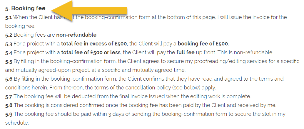
Of course, anyone required to pay a deposit knows full well that the financial definition is being referred to. Nevertheless, using the language of money – a fee – might well encourage time-wasters to think twice.
The following might also work for you:
What you charge upfront is up to you. Some editors charge a 50% booking fee rather than a flat rate. Some require one third to secure the booking, another third just before editing starts, and the remaining third upon completion of the project. You can define your own model.
Do you have a booking form?
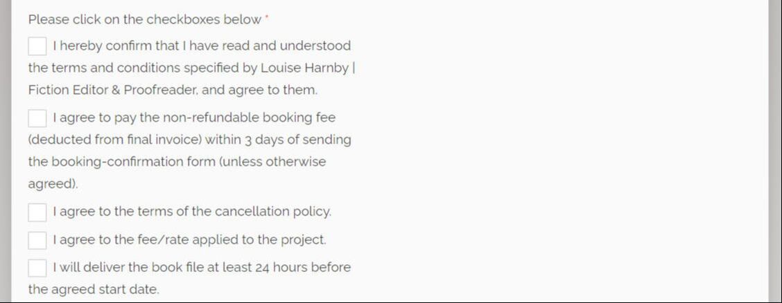
You and a client can agree to your providing editorial services via email, and emails count contractually. But how about requiring a specific additional action, one that reinforces a sense of commitment?
Asking someone to fill in a booking form that confirms they have read, understood and agreed to your terms and conditions, including your booking fee and your cancellation policy, means they have to make a proactive decision to commit.
When it comes to filling in a form and ticking boxes, a non-committed client is less likely to feel comfortable than a good-fit one because it feels more formal.
You can create a PDF booking form that you’ll email manually, or create the form on your website. My choice is the latter. I include it below my T&Cs. That way, the booking and the terms are closely linked.
Here’s a screenshot of mine. Notice the boxes that must be checked in order to confirm the booking.
The following might also work for you:
- down payment
- advance payment
- prepayment
What you charge upfront is up to you. Some editors charge a 50% booking fee rather than a flat rate. Some require one third to secure the booking, another third just before editing starts, and the remaining third upon completion of the project. You can define your own model.
Do you have a booking form?
You and a client can agree to your providing editorial services via email, and emails count contractually. But how about requiring a specific additional action, one that reinforces a sense of commitment?
Asking someone to fill in a booking form that confirms they have read, understood and agreed to your terms and conditions, including your booking fee and your cancellation policy, means they have to make a proactive decision to commit.
When it comes to filling in a form and ticking boxes, a non-committed client is less likely to feel comfortable than a good-fit one because it feels more formal.
You can create a PDF booking form that you’ll email manually, or create the form on your website. My choice is the latter. I include it below my T&Cs. That way, the booking and the terms are closely linked.
Here’s a screenshot of mine. Notice the boxes that must be checked in order to confirm the booking.
Is ‘booking form’ a strong enough term?
Even if someone is prepared to fill in a form and check some boxes, agreeing to a contract might make them think twice. That has a more legally binding feel about it; it’s more formal. And it might be the thing that repels someone who’s going to let you down.
My T&Cs state that the booking-confirmation form is an agreement to the contract of services between me and the client, and the phrase ‘Contract of services agreement’ in the heading is what appears when they click on the booking-confirmation form button.


Are your terms and conditions detailed enough?
In the main, your website should be client-focused. It should make the client feel that you understand their problems, are able to deliver solutions, and understand what the impact of your solutions will be.
Your brand voice should sing out loud. In my case, for example, that means using a gentle, nurturing tone.
However, when it comes to your terms and conditions, forget all the touchy-feely stuff – this is where you and the client get down to business. It’s in everyone’s interests to know what’s what.
That might mean that your T&Cs are rather dull and boring. No matter. It’s the one place on your website where you’re allowed to be dull and boring!
I feel like chewing my own arm off when I read my T&Cs but I don’t want any of my clients in doubt about what I’m offering and what they’re getting.
Think about the following:
A non-committed client will be repelled if your terms put them at risk. A good-fit client will feel reassured that they’re dealing with a fellow professional who takes the editing work as seriously as they do.
Are the basics front and centre?
Many editors place links to the detailed contractual stuff in their website’s footer, which means the T&Cs are almost invisible. Even a good-fit client probably won’t see or read your T&Cs during their initial search for editorial services.
That’s the case on my website. If it’s the same for you, consider placing the basics front and centre.
I’ve created a box on my contact page that spells out the non-refundable booking fee I charge.
In the main, your website should be client-focused. It should make the client feel that you understand their problems, are able to deliver solutions, and understand what the impact of your solutions will be.
Your brand voice should sing out loud. In my case, for example, that means using a gentle, nurturing tone.
However, when it comes to your terms and conditions, forget all the touchy-feely stuff – this is where you and the client get down to business. It’s in everyone’s interests to know what’s what.
That might mean that your T&Cs are rather dull and boring. No matter. It’s the one place on your website where you’re allowed to be dull and boring!
I feel like chewing my own arm off when I read my T&Cs but I don’t want any of my clients in doubt about what I’m offering and what they’re getting.
Think about the following:
- How much do you charge for a booking fee or advance payment?
- What are the penalties for cancellation and when do they kick in?
- Is final payment required before the edited project is delivered to the client?
- If you’ll deliver first, will payment be required immediately? Within 7 days? Within 30 days?
- Are there penalties for late payment of the final invoice?
- Does your booking form require confirmation that your terms have been read, understood and agreed to?
A non-committed client will be repelled if your terms put them at risk. A good-fit client will feel reassured that they’re dealing with a fellow professional who takes the editing work as seriously as they do.
Are the basics front and centre?
Many editors place links to the detailed contractual stuff in their website’s footer, which means the T&Cs are almost invisible. Even a good-fit client probably won’t see or read your T&Cs during their initial search for editorial services.
That’s the case on my website. If it’s the same for you, consider placing the basics front and centre.
I’ve created a box on my contact page that spells out the non-refundable booking fee I charge.
Will it put off some potential clients? Absolutely. But if someone can’t afford that booking fee or doesn’t dare take the risk of making a payment because they’re unsure whether they’ll honour the contract, they’re not the right client for me.
Spotting red flags
Developing your spidey sense can reduce the likelihood of becoming entangled with those who’ll back out of confirmed bookings or fail to pay.
Spotting red flags
Developing your spidey sense can reduce the likelihood of becoming entangled with those who’ll back out of confirmed bookings or fail to pay.

Though there’s no foolproof way to protect yourself from non-committed clients, there are red flags you can look out for:
Summing up
I hope these tips help you avoid non-committed clients and safeguard your business. Even if you implement some of my ideas, there are no guarantees unless you ask for 100% of your fee upfront. However, rest assured that most clients are honest, committed and trustworthy individuals who are a pleasure to work with.
As for those who blow you out, a few are scoundrels. Others aren’t but are thoughtless and haven’t taken the time to understand the emotional and financial impact of cancellations and non-payment. Others have got cold feet. And some have been struck by unusual or extraordinary circumstances like bereavement. Most don’t mean to cause distress or place editors in financial hardship, even though those are two very real potential outcomes.
By using real-money language and action-driving tools, we can build stronger bonds of trust with those who are serious about working with us, and repel most of those who aren’t.
More resources
- The person tells you they want to go ahead and hire you for a specific time frame but doesn’t fill in the booking form, or you have to nudge them several times. This could indicate that they’re not yet committed to working with you.
- The person fills in the booking form but fails to pay your booking fee. This is a strong indicator that the funds are not in place, and might never be.
- The person fills in a booking form and pays the fee but seeks to change the terms they booked under. This is a strong indicator that they’re not in the right mindset to commit to your editing services.
- The person is consistently slow to respond to emails during the initial discussion phase, and needs frequent nudging about the state of play. This might indicate that they don’t take your business offering seriously.
- The person gives you conflicting information about what’s required, or repeats questions about money and dates that you’ve already answered. This indicates they’ve not read your correspondence properly, which could lead to problems later.
- The person hasn’t begun the writing process, or has but isn’t sure when they’ll finish. If you don’t keep in regular touch with the client to check the project’s on track – which is time-consuming – the project could go off the rails and you’ll be none the wiser.
Summing up
I hope these tips help you avoid non-committed clients and safeguard your business. Even if you implement some of my ideas, there are no guarantees unless you ask for 100% of your fee upfront. However, rest assured that most clients are honest, committed and trustworthy individuals who are a pleasure to work with.
As for those who blow you out, a few are scoundrels. Others aren’t but are thoughtless and haven’t taken the time to understand the emotional and financial impact of cancellations and non-payment. Others have got cold feet. And some have been struck by unusual or extraordinary circumstances like bereavement. Most don’t mean to cause distress or place editors in financial hardship, even though those are two very real potential outcomes.
By using real-money language and action-driving tools, we can build stronger bonds of trust with those who are serious about working with us, and repel most of those who aren’t.
More resources
Louise Harnby is a line editor, copyeditor and proofreader who specializes in working with crime, mystery, suspense and thriller writers.
She is an Advanced Professional Member of the Chartered Institute of Editing and Proofreading (CIEP), a member of ACES, a Partner Member of The Alliance of Independent Authors (ALLi), and co-hosts The Editing Podcast.
She is an Advanced Professional Member of the Chartered Institute of Editing and Proofreading (CIEP), a member of ACES, a Partner Member of The Alliance of Independent Authors (ALLi), and co-hosts The Editing Podcast.
- Get in touch: Louise Harnby | Fiction Editor & Proofreader
- Connect: Twitter at @LouiseHarnby, Facebook and LinkedIn
- Learn: Books and courses
- Discover: Resources for authors and editors
Here’s how to build a knockout editing portfolio page even if you’re relatively new to the field.

Deciding what to include, what to omit, and how to lay it out so that it grabs a potential client’s attention can be tricky. If your business is new you might not have a lot to shout about. If you’re established, you might have too much.
One thing’s for sure, though – an editing site without a visible portfolio is at a disadvantage. It’s the next best thing to the social proof of a testimonial because it demonstrates that you practise what you preach.
Using stories is a method every editor can use to bring their portfolio page to life.
Moving from mechanics to emotions
Stories are lovely additions to any portfolio page because they give us the opportunity to take our potential clients behind the scenes ... to show them how we helped and how the project made us feel.
That’s important because it shifts the attention away from mechanics and towards emotion.
Those of us who work with non-publisher clients such as independent authors, academics, businesses and students are asking our clients to take a big leap ... to put their project in the hands of someone they’ve never met, and pay for the privilege.
It’s a huge ask and takes not a little courage for some. Think about it from the client’s point of view:
These clients will be looking for an editor they can trust, someone who gets them, understands what their problems are and can solve them without making a song and dance about it.
Trust is something that is usually earned over time – think about your friendships and partnerships. Editors and their clients don’t always have the luxury of time. What’s needed is something that will fast-track the growth of trust.
Word-of-mouth recommendations are fantastic for this. Testimonials from named clients are also excellent social proof. Portfolios work in the same way. The problem is, they can be boring.
One thing’s for sure, though – an editing site without a visible portfolio is at a disadvantage. It’s the next best thing to the social proof of a testimonial because it demonstrates that you practise what you preach.
Using stories is a method every editor can use to bring their portfolio page to life.
Moving from mechanics to emotions
Stories are lovely additions to any portfolio page because they give us the opportunity to take our potential clients behind the scenes ... to show them how we helped and how the project made us feel.
That’s important because it shifts the attention away from mechanics and towards emotion.
Those of us who work with non-publisher clients such as independent authors, academics, businesses and students are asking our clients to take a big leap ... to put their project in the hands of someone they’ve never met, and pay for the privilege.
It’s a huge ask and takes not a little courage for some. Think about it from the client’s point of view:
- An indie author has put their heart and soul into a work of fiction. It’s personal. They’ve used their own experiences to give life and depth to their characters.
- An agency has developed a series of advertisements for a big-name corporation. It’s not just the agency’s rep on the line. There’s a global brand at stake.
- An academic whose first language isn’t English is submitting their research to a peer-reviewed journal. Getting published could be career-changing for them.
These clients will be looking for an editor they can trust, someone who gets them, understands what their problems are and can solve them without making a song and dance about it.
Trust is something that is usually earned over time – think about your friendships and partnerships. Editors and their clients don’t always have the luxury of time. What’s needed is something that will fast-track the growth of trust.
Word-of-mouth recommendations are fantastic for this. Testimonials from named clients are also excellent social proof. Portfolios work in the same way. The problem is, they can be boring.
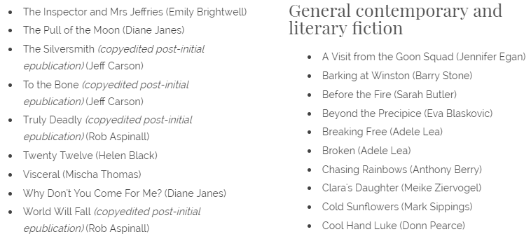
A partial screenshot of my boring but useful list!
The list: boring but powerful
I’m not going to suggest you dump your long lists. Boring though they may be, I believe there’s power in them, and for two reasons:
- Keyword juice: Book and article titles, and author names can be good for SEO. Some years ago, I secured a proofreading job with an academic who’d come across my website while searching for information about a social theorist. One of the theorist’s books was included in a bullet list in my academic portfolio, and the page popped up in Google’s search results.
- Demonstration of experience: Lists of completed projects can pack a punch because they show at a glance that you can do what you say on your editing tin.
So, if you want to keep your long lists, do so. I have. Make them more accessible and aesthetically pleasing by breaking them into subjects or genres.
Add thumbnails of book jackets, journal covers or client logos (subject to securing permission from the client).
Use a carousel or slideshow plug-in to show off multiple images without cluttering up the page.
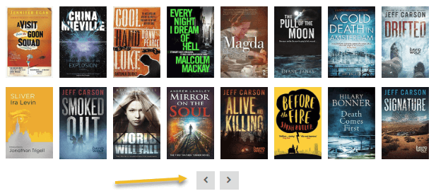
Carousel of thumbnail images with scroll buttons
Adding pizzazz with stories
Now it’s time to add the wow factor. Stories take the portfolio one stage further. They’re basically case studies of editing and proofreading in practice. Can you recognize yourself in the following list?
Stories work for all three groups of editors:
What to include
It’s up to you what you include but consider the following:
Now it’s time to add the wow factor. Stories take the portfolio one stage further. They’re basically case studies of editing and proofreading in practice. Can you recognize yourself in the following list?
- The established editor: You have a long, boring list but you want to keep your visitors awake.
- The NDA-bound editor: You’re prevented from publishing a long, boring list because of the non-disclosure agreements you’ve signed.
- The new editor: You’d love to have a long, boring list but that’s not yet your problem. Filling space is.
Stories work for all three groups of editors:
- The established editor: You can focus on two or three projects and talk about what the client was looking for, how you helped, what you loved and what you learned.
- The NDA-bound editor: You can omit brand names and concentrate on the client’s problems, how you solved them, and what the outcomes were.
- The new editor: Even if you’ve completed only 4 projects, you can make your portfolio page sing by going deeper into the story behind the editing project.
What to include
It’s up to you what you include but consider the following:
- The ideal client: What kind of voice will be most compelling to them? What’s worrying them, and how might you fix that? How do you want them to feel when they’re on your website?
- Your brand values: What do you stand for? What makes you tick? What excites you about your job?
- Problems and solutions: What challenges have you faced, how did you overcome them and what was the result?
Example 1
I’m a fiction editor who works for a lot of first-time novelists. Many haven’t worked with an editor and don’t know what to expect. Some feel anxious and exposed. My two portfolio stories have a friendly, informal tone.
One of my case studies focuses on a self-publishing series author whose fictional world I’ve become close to. By showing how we work together and how his writing makes me feel, I demonstrate my advocacy for self-publishing and the thrill I get from working with indie authors, the emotional connection I make with the characters, and the delight I experience in seeing writers hone their craft.
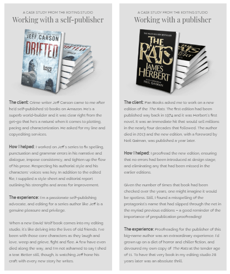
Two case studies from the editing studio
Example 2
If you work with corporates, your stories might have a reassuring, professional tone that conveys confidence and pragmatism.
Your case studies could feature clients whose projects required the management of privacy and confidentiality concerns. You could use the space to talk about the challenges you faced and the successes you and your clients achieved even though the projects were complex and demanding.
Example 3
If you work with publishers, you could create case studies that show how you managed tight deadlines, a controlled brief, and a detailed style guide.
The stories could highlight some of the problems you and the publisher overcame, your enthusiasm for the subject area, the pride you felt on seeing the book published, knowing the part you’d played in its publication journey.
Crafting stories about relationships
If your home page is all about the client, the portfolio page can be all about relationships. By crafting stories for our portfolios, we can invite potential clients onto the stage and let them experience – if only fleetingly – editing in action.
And because the case studies are real, they’re a powerful tool for knocking down barriers to trust. They show a client how we might help them, just as we’ve helped others.
Louise Harnby is a line editor, copyeditor and proofreader who specializes in working with crime, mystery, suspense and thriller writers.
She is an Advanced Professional Member of the Chartered Institute of Editing and Proofreading (CIEP), a member of ACES, a Partner Member of The Alliance of Independent Authors (ALLi), and co-hosts The Editing Podcast.
Visit her business website at Louise Harnby | Fiction Editor & Proofreader, say hello on Twitter at @LouiseHarnby, connect via Facebook and LinkedIn, and check out her books and courses.
Here's how to organize your best proofreading and editing resources so that they're visible to and usable for your ideal clients.


Learning centres for proofreaders and editors
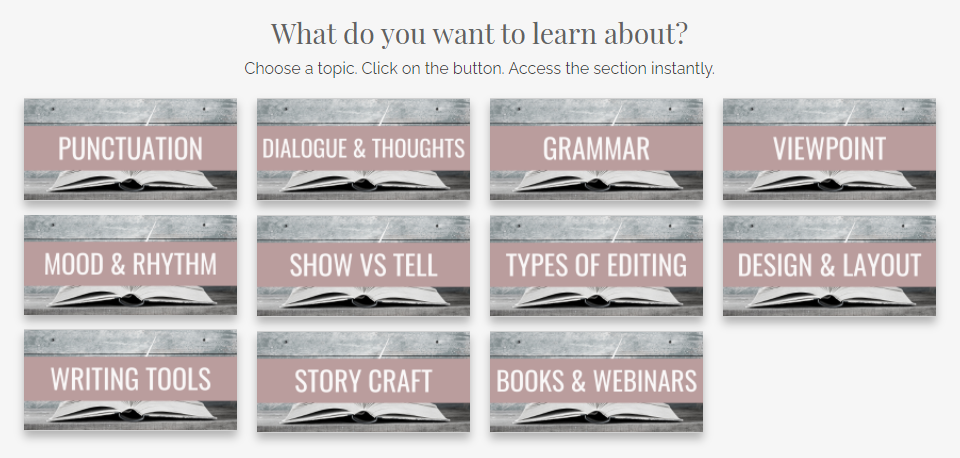
I have two learning centres on my website, one for authors and one for editors.
Each topic has an image. Clicking on that picture takes the visitor to a section further down on the page that contains useful relevant content. Maybe it's a blog post, a Word file, a PDF booklet, a video, podcast or an Excel spreadsheet.
Most of that stuff is on my blog too, so why did I create dedicated pages to curate it? Here are my 8 reasons:
1. Learning centres help visitors find your useful stuff
It's much easier for a visitor to navigate from one resource to another when you offer clearly titled images in one place than it is to find what you want in a search bar or blog archive.
And if they get distracted, it’s easy to start the content review process all over again back in the centre. That might not be so easy if they’re on a 7-year-old blog with several hundred articles on it, especially if the ones they want to read sit in different subject- or month-archives.
Your visitor can also bookmark a learning centre on your site. They can’t do that with a list of results generated by your search bar. They can probably bookmark an archive, but that will only show the first article or two on your blog, not a chunk of your core resources at a glance.
2. Learning centres keep your visitors on your site for longer because there’s more to engage with
The more goodies you offer visitors, the greater their engagement. That’s good for obvious reasons – you’re helping your clients, showing them you’re engaged with their problems, and are willing and able to solve them.
But there’s another important reason. The longer someone sticks around on your site, the more likely they are to hire your editorial services.
It’s no surprise, really – I don’t stick around in a high-street shop, desperately trying to find that one thing I want, if the overall feel of the place and the products it’s selling don’t feel like me. But if I keep finding things that grab my attention, I’m much more likely to walk out of the door with something nice.
Editorial websites are no different. If your learning centre makes potential clients drool because you’re offering them a lot of free, helpful, valuable content, if it makes them feel that you get them, and that you’re a good fit for each other, you have a much higher chance of persuading that person to ask for a quote or a sample edit/proofread.
3. Learning centres reinforce your brand
Learning centres are perfect for reinforcing your brand identity because you can create a uniform look and feel by theming your images with consistent brand colours, fonts, and design.
Include a few lines of text at the top to explain who your resources are for, and what problems they’ll solve – your mission, so to speak.
Here’s a partial sample of the image in my author resources page.
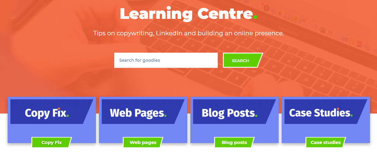
And here's a partial shot of John Espirian's library. John's learning centre has a very different feel to it, and so it should. His brand identity is built around a different set of skills, services and target clients.
4. Learning centres demonstrate your expertise and arouse clients’ emotions
With a learning centre. you can offer a chunk of accessible information that solves multiple problems. That presents you as an expert who sees the big picture.
It’s not a labyrinthine process of discovery that involves extensive scrolling or putting the right keywords into a search box. Rather, you hit them in the heart with a message that you’re on their side and have their backs.
It’s about arousing powerful emotions. In episode 3 of Content Mavericks, pro content marketers Andrew and Pete argue that high-arousal messages like awe, excitement, relief, and love are much more likely to generate engagement than lower-arousal messages like contentment. ‘When we care we share … Figure out a way to make people care about your message or your offering.’
If your learning centre can generate excitement in your potential client – make them feel that they’ve found an editor or proofreader who’s completely on their wavelength, someone who’s demonstrably in touch with their struggles, and is offering resolution – that’s a powerful message.
And it’s one that’s more likely to get your visitors telling others about who you are and what you’re up to, and have them clicking the Contact button.
5. Eye candy
I cherish my blog. I’ve lovingly filled it with articles on a weekly (mostly) basis since 2011. But things can get messy. There’s a sidebar with a subscription button, an RSS button, a search box, an archive by subject area, an archive by date, some links to my books, and more.
Plus, I love to write meaty posts. Most of my articles are at least 1,500 words long. And while I do include images and header stamps that summarize what’s included in each post, there’s an awful lot of text.
That’s not all. There’s a lot of scrolling to do if someone wants to glimpse what’s available on one page of the blog. A learning centre is much easier on the eye and allows my author visitors to see at a glance what’s on offer.
6. Segmentation
Back in the day when I worked exclusively for publishers, my blog posts were aimed at my colleagues. These days I work exclusively for indie authors, and now I’m creating content for them, too. So I have two audiences, and two types of content. It’s about a 50–50 split.
Creating learning centres helps me to segment my website so that the right people can find the relevant content. This is particularly important for my author audience because most of them don’t yet know me. They’re less likely to bounce around in my blog, diving from one archive to another in a bid to find what they need.
Many of my colleague visitors do know me, at least in an online capacity. And so they have a little more patience because I’ve already built a trusting relationship with them. They’re more likely to spend time rooting around the blog for what they want. Still, I've created an editor resources page for them because I want them to find stuff easily.
Show off what you’ve got planned
What if you have a ton of great stuff in your head or on a to-do list? Perhaps it's already in production, out with the proofreader, or scheduled for publication sometime in the next few months. None of that stuff is visible on your blog.
Your blog only tells people about what’s available. What’s coming might be equally appealing. They might be more likely to get in touch if they can see exciting things in the pipeline. In that case, upload an image with a 'forthcoming' caption.
8. Learning centres encourage ‘you’re worth it’ moments
Certainly, a great resource library will increase the likelihood of your visitor hitting the contact button, but not everyone will be ready to make that commitment.
That’s why building a mailing list is a great way to keep in touch with potential clients who are thinking: I’m interested in you and like what you’re doing, but I’m not quite at the point where I’m ready to hire you as my editor or proofreader.
Still, it seems like everyone and their aunt has a mailing list or newsletter these days. And if you’re going to persuade someone to allow yet another email into their already crowded inbox, and make them want to actually open it, displaying a library of gorgeous resources might just be the tipping point – the thing that makes them think you’re worth it.
Make sure your hub includes a way of signing up to your mailing list, and a clear call to action that tells the visitor what you want them to do, and why.
Summing up
Make your wonderful editorial content easy to access. Whether it’s a blog, a vlog, a podcast, or something else, help your potential clients navigate their way around your resources and show them all the marvellous stuff on offer.
Tell them who and what it’s for – how it helps, which problems it solves.
And make sure it's designed uniformly (Canva is your free friend – trust me!) so that the resources look like they're part of a stable. That way it’s not a hotchpotch of stuff; it’s valuable, client-focused content that represents you, your editorial business, your professional values, and your mission – your brand identity.
Louise Harnby is a line editor, copyeditor and proofreader who specializes in working with crime, mystery, suspense and thriller writers.
She is an Advanced Professional Member of the Chartered Institute of Editing and Proofreading (CIEP), a member of ACES, a Partner Member of The Alliance of Independent Authors (ALLi), and co-hosts The Editing Podcast.
Visit her business website at Louise Harnby | Fiction Editor & Proofreader, say hello on Twitter at @LouiseHarnby, connect via Facebook and LinkedIn, and check out her books and courses.
She is an Advanced Professional Member of the Chartered Institute of Editing and Proofreading (CIEP), a member of ACES, a Partner Member of The Alliance of Independent Authors (ALLi), and co-hosts The Editing Podcast.
Visit her business website at Louise Harnby | Fiction Editor & Proofreader, say hello on Twitter at @LouiseHarnby, connect via Facebook and LinkedIn, and check out her books and courses.

PDF MARKUP
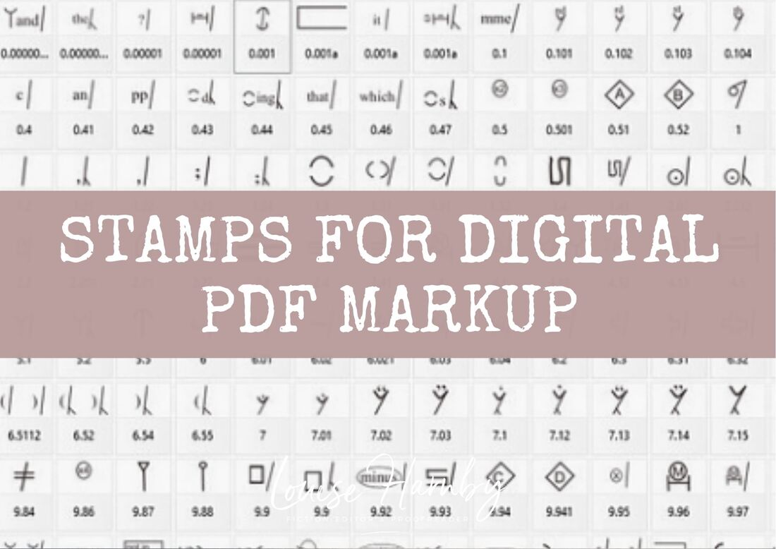
AUTHOR RESOURCES

EDITOR RESOURCES

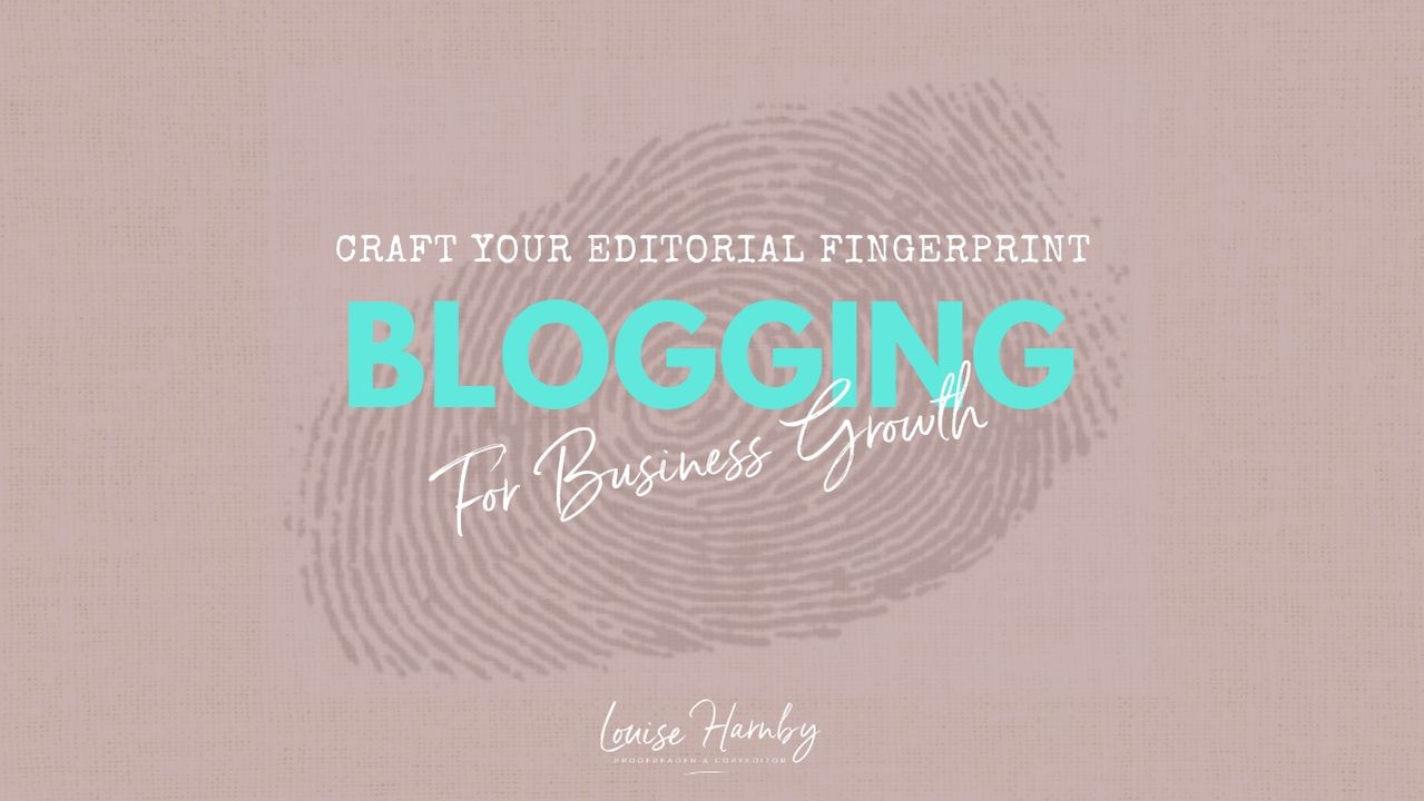
TESTIMONIALS
Dare Rogers
'Louise uses her expertise to hone a story until it's razor sharp, while still allowing the author’s voice to remain dominant.'
Jeff Carson
'I wholeheartedly recommend her services ... Just don’t hire her when I need her.'
J B Turner
'Sincere thanks for a beautiful and elegant piece of work. First class.'
Ayshe Gemedzhy
'What makes her stand out and shine is her ability to immerse herself in your story.'
Salt Publishing
'A million thanks – your mark-up is perfect, as always.'
CATEGORIES
All
Around The World
Audio Books
Author Chat
Author Interviews
Author Platform
Author Resources
Blogging
Book Marketing
Books
Branding
Business Tips
Choosing An Editor
Client Talk
Conscious Language
Core Editorial Skills
Crime Writing
Design And Layout
Dialogue
Editing
Editorial Tips
Editorial Tools
Editors On The Blog
Erotica
Fiction
Fiction Editing
Freelancing
Free Stuff
Getting Noticed
Getting Work
Grammar Links
Guest Writers
Indexing
Indie Authors
Lean Writing
Line Craft
Link Of The Week
Macro Chat
Marketing Tips
Money Talk
Mood And Rhythm
More Macros And Add Ins
Networking
Online Courses
PDF Markup
Podcasting
POV
Proofreading
Proofreading Marks
Publishing
Punctuation
Q&A With Louise
Resources
Roundups
Self Editing
Self Publishing Authors
Sentence Editing
Showing And Telling
Software
Stamps
Starting Out
Story Craft
The Editing Podcast
Training
Types Of Editing
Using Word
Website Tips
Work Choices
Working Onscreen
Working Smart
Writer Resources
Writing
Writing Tips
Writing Tools
ARCHIVES
July 2024
June 2024
May 2024
April 2024
March 2024
October 2023
August 2023
July 2023
June 2023
May 2023
April 2023
March 2023
January 2023
December 2022
November 2022
October 2022
September 2022
August 2022
July 2022
June 2022
May 2022
April 2022
March 2022
February 2022
January 2022
December 2021
November 2021
October 2021
September 2021
August 2021
July 2021
June 2021
May 2021
April 2021
March 2021
February 2021
January 2021
December 2020
November 2020
October 2020
September 2020
August 2020
July 2020
June 2020
May 2020
April 2020
March 2020
February 2020
January 2020
December 2019
November 2019
October 2019
September 2019
August 2019
July 2019
June 2019
May 2019
April 2019
March 2019
February 2019
January 2019
December 2018
November 2018
October 2018
September 2018
August 2018
July 2018
June 2018
May 2018
April 2018
March 2018
February 2018
January 2018
December 2017
November 2017
October 2017
September 2017
August 2017
July 2017
June 2017
May 2017
April 2017
March 2017
February 2017
January 2017
December 2016
November 2016
October 2016
September 2016
June 2016
May 2016
April 2016
March 2016
February 2016
January 2016
December 2015
November 2015
October 2015
September 2015
July 2015
June 2015
May 2015
March 2015
February 2015
January 2015
November 2014
October 2014
September 2014
August 2014
July 2014
June 2014
March 2014
January 2014
November 2013
October 2013
September 2013
August 2013
June 2013
February 2013
January 2013
November 2012
October 2012
September 2012
August 2012
July 2012
June 2012
May 2012
April 2012
March 2012
February 2012
January 2012
December 2011
 RSS Feed
|
|
|
|

|

|
|
|
|

© 2011–2024 Louise Harnby