

|
Today's article is all about optimizing your proofreading or editing business website so that it works for clients using different device types.
My website is the single biggest driver of my proofreading and copyediting work. It’s therefore essential that it shows potential clients my best face. 
I’ve spent years tinkering – tweaking current content, adding new information and removing text and images that have outgrown their usefulness.
Weebly, like many web-hosting services, allows me to optimize my website for mobile devices.* It takes my chosen desktop theme and adapts the design for optimal viewing on a smaller device such as a tablet or mobile phone. This function has been available for several years. I can’t remember when I became aware of it, but I figured it made sense to switch it on because I couldn't imagine anyone with a smart phone having the patience to navigate through my content if it wasn’t mobile friendly. I congratulated myself on being so forward-thinking, and carried on as normal. Note: If you're unsure whether your website is mobile friendly, it's easy to find out. My colleague Averill Buchanan alerted me to Google's Mobile-Friendly Test site. Is it pretty, or pretty awful? Most website-hosting services help non-designers like me to make our websites look pretty. They give us dividers, shaded boxes, spacers, columns, textboxes and image placers to enable us to put our content exactly where we want it. The result is that on the desktop version, at least, everything looks just so. You might be the kind of person who likes to keep things simple – you might have opted for minimal text on your site, and the text you have placed might not be broken into separate textbox elements. To date, I’ve not been this kind of person. I’ve overly complicated things, and, I might add, it hasn’t done me any favours. Here’s just one example. This is the contact information on my site: 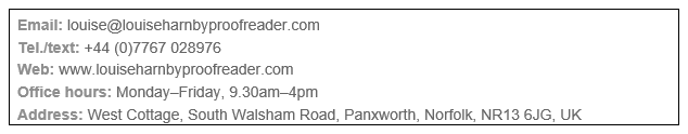
Now, back in 2011, when I first typed this information into my contact page, I didn’t like the vertical alignment of the information after the colons. Weebly doesn’t allow tabbing, so I created two textboxes (below, outlined in red) and placed them next to each other in two columns.

Okay, so it was never going to win a design award, but I’d achieved my goal. However, there was a problem – it looked perfect in the desktop view, but the mobile layout was a disaster:
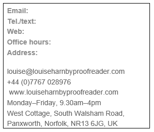
This wasn’t Weebly’s fault, it was mine. Weebly’s mobile optimization tool was working perfectly logically – finding content in a single textbox and ensuring that said content remained unbroken.
The solution was simple – I had to restore my original layout, putting all the text back into a single box – but the impact was huge. It did mean sacrificing the alignment issue that I’d had a bee in my bonnet about, but it was worth it. Now my mobile display looks like this (on iPhone 6): 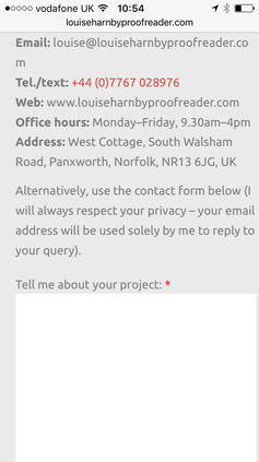
It’s not perfect (there are unsightly end-of-line breaks on smaller mobile screens), but it’s a far more sensible and logical design for my mobile visitors. I’ll shortly be making decisions about how to reword this information so that I can remove the unwanted wordbreaks – it needs some care because I don’t want to compromise the design of the desktop view.
What devices are my visitors using? The crux of the matter here is that I want to put myself in my customers’ shoes. I need to bear in mind the following:
A webpage that looks perfect on a mobile might be less pleasing to the eye on a desktop screen, and vice versa. I’m under no illusion that I can optimize my design for every potential client all of the time. But paying attention to the mobile display has been a learning experience for me. I’ve discovered that I’ve not been showing my best face, and that’s simply not an option in the current market. I know this because my data tells me so. Looking at the data Honestly, I’ve only recently started looking at data about which devices my visitors are using. The following was taken from one of the analytics programs I use, StatCounter. 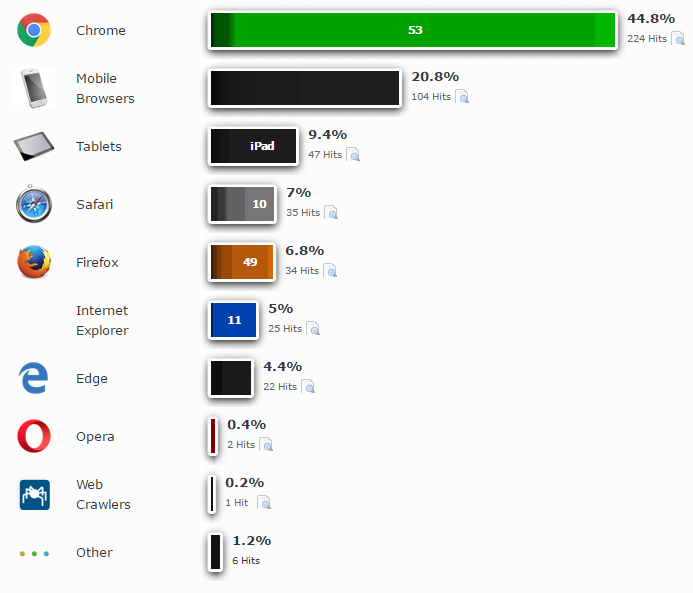
The above image shows two days’ worth of data (8–10 October 2016). A whopping 30% of my visitors used mobile phones and tablets to access my content.
Some tablet screens are big enough to make browsing my website in desktop view perfectly palatable, so some of the visitors using these devices may not be looking at a mobile view. Here’s the thing, though – I don’t know which view they’re seeing and it’s not under my control. It’s therefore important that I do what I can to put my best face forward, just in case. Even one lost customer who searched and found me via their mobile, and then dismissed my services because my content was illogically presented, is something I want to avoid. The view from an expert My friend Andy McNair, who’s forgotten more about website analytics than I’ll ever know, pointed out that two days’ worth of data could be horribly skewed by a range of factors. He prompted me to dig a little deeper using my Google Analytics historical data. Says Andy in relation to industry at large: In 2016, 1 in 5 visits to corporate communication sites are made on smartphones. Tablet has been static at 1 in 20 for the last 3 years. Desktop is still the most important group so don't cripple your user experience there.
I followed Andy’s advice and compared data in four quarters (August–October) from 2013, 2014, 2015 and 2016.
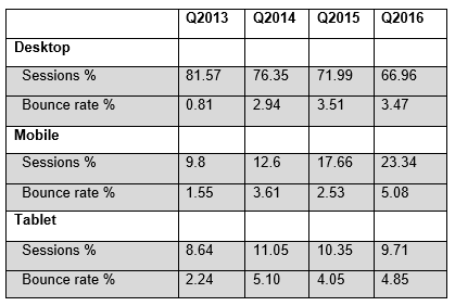
This rather basic analysis supports Andy’s industry view and has encouraged me to continue to work on my mobile optimization to ensure that it’s user-friendly, while respecting the fact that desktop visitors are still the most important group. Therefore, mobile responsiveness mustn't come at the expense of the desktop-user experience. When thinking like a editor isn’t enough This exercise has shown me how, until recently, my website design was dominated by two modes of thinking:
I now know that I need to think less like an editor and more like a designer and a potential client when I’m building webpages. Taking the long view Keeping an eye on user behaviour is a work in progress, but I'm on the case. Four years ago, mobile usage mattered less. Now, to me, it matters twice as much (though the desktop-user group is still by far the most important). So, take a look at your analytics to assess what devices your visitors are using. If mobile has become more important and your website host allows you to easily optimize your design for mobile devices, without compromising your core visitor group, do use the function. But check that the results are showing your best face. A few small tweaks could make a very big difference. More importantly, they could turn a closed page into a closed deal.
* If you’re a Weebly user, and you’re not sure whether you’ve optimized your website for mobile devices, open up your dashboard, go to your site, click on the Settings tab on the ribbon, scroll down to Mobile, and make sure the ‘Display the mobile-optimized version of this website when someone visits from a mobile device’ box is ticked.
To take a quick look at how your content is being displayed on mobile devices, choose the Build or Pages tabs from the ribbon, and click on the Device Switcher icon (also on the ribbon). A word of caution: I’ve found that after toggling back and forth between the desktop and mobile views in Device Switcher, I have problems making some types of amendments to my content (for example creating bullet points, italicizing and moving textboxes). Don’t worry if this happens to you. Simply exit Weebly and reopen; you’ll be able to amend as required.
Louise Harnby is a line editor, copyeditor and proofreader who specializes in working with crime, mystery, suspense and thriller writers.
She is an Advanced Professional Member of the Chartered Institute of Editing and Proofreading (CIEP), a member of ACES, a Partner Member of The Alliance of Independent Authors (ALLi), and co-hosts The Editing Podcast.
5 Comments
18/10/2016 12:57:15 pm
Great post, Louise, and one that gives me a good kick up the bum. Optimizing my website has been on my to-do list for too long.
Louise Harnby
18/10/2016 01:25:32 pm
Thanks for that link, Averill! That's brilliant. I'm adding your comment to the main article in case readers don't read the comments. 20/10/2016 09:30:07 am
Excellent article (again), Louise.
Paul Campbell
6/4/2018 08:50:36 am
Interesting article. Thank you!
Louise Harnby
6/4/2018 10:40:07 am
Thank you, Paul. Leave a Reply. |
PDF MARKUP
AUTHOR RESOURCES
EDITOR RESOURCES
TESTIMONIALSDare Rogers'Louise uses her expertise to hone a story until it's razor sharp, while still allowing the author’s voice to remain dominant.'Jeff Carson'I wholeheartedly recommend her services ... Just don’t hire her when I need her.'J B Turner'Sincere thanks for a beautiful and elegant piece of work. First class.'Ayshe Gemedzhy'What makes her stand out and shine is her ability to immerse herself in your story.'Salt Publishing'A million thanks – your mark-up is perfect, as always.'CATEGORIES
All
ARCHIVES
July 2024
|


 RSS Feed
 |
|
|

|

|
|
|
|

© 2011–2024 Louise Harnby